Adeptly
Adeptly is an online learning platform with hundreds of classes and tutorials that keeps individuals motivated and helps them to reach their goals.
Type
Responsive website
Role
Sole UX/UI designer
Tools
Figma, pen, paper
Research-Ramp Up
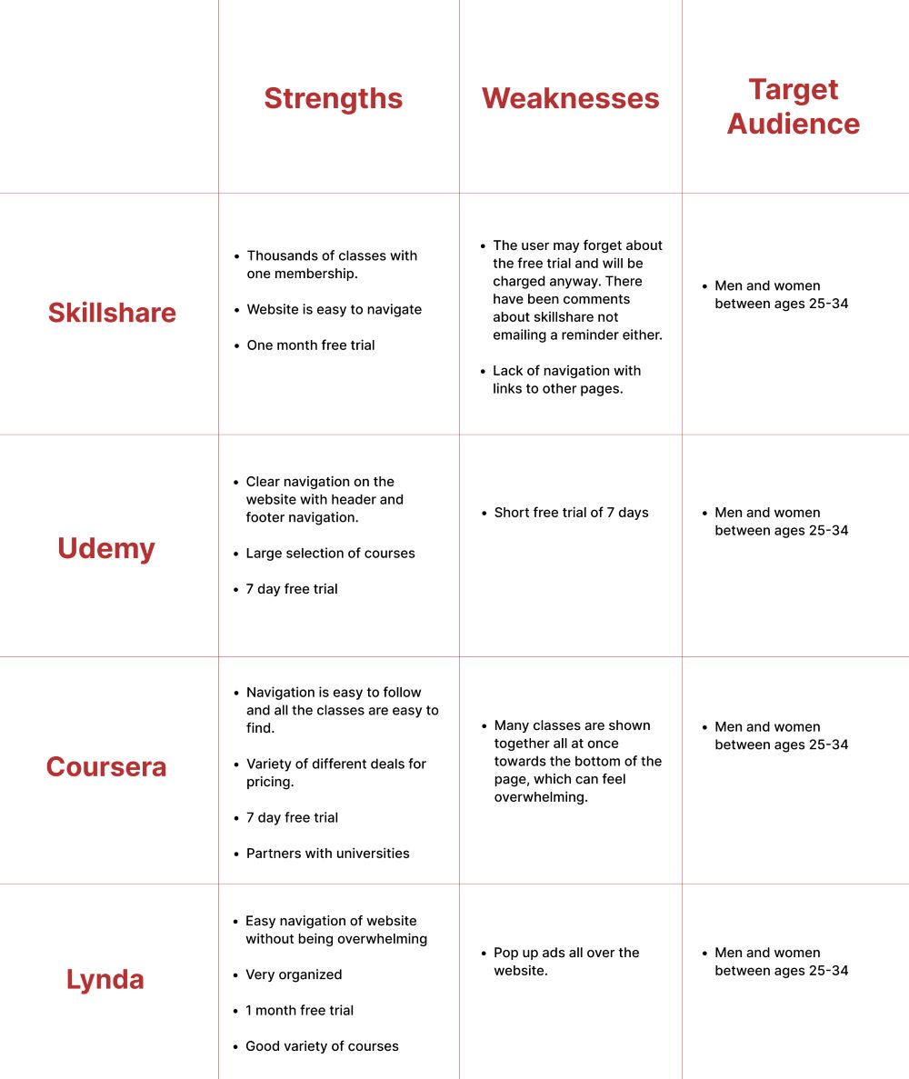
I decided to do a competitive analysis and user interviews to start. I did the competitive analysis to see the competitor’s target audience, mission statements, pricing, strengths, and weaknesses. User interviews were done after. The interviews helped me to figure out who my audience should be, their pain points, and the problem.
User Interviews
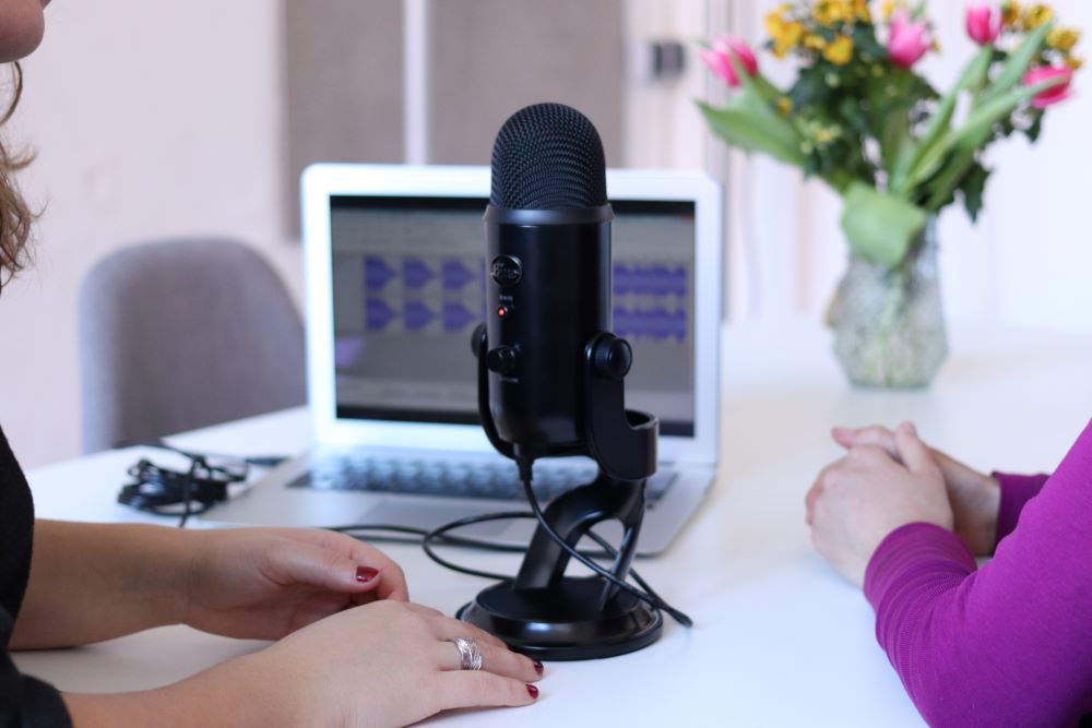
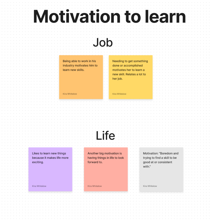
8 participants between the ages of 20-60 were interviewed. The results were then compiled into affinity maps to help me see trends.
Results
- 3 individuals identified as visual learners and 2 identified as hands on learners.
- 7 participants reported using YouTube to help them learn new skills.
- 6 participants reported lack of time as a reason for them being discouraged to learn a new skill.
How Might We?
Point of view and how might we statements were put together based on the affinity mapping results. One statement was chosen that would be the problem this product would solve.
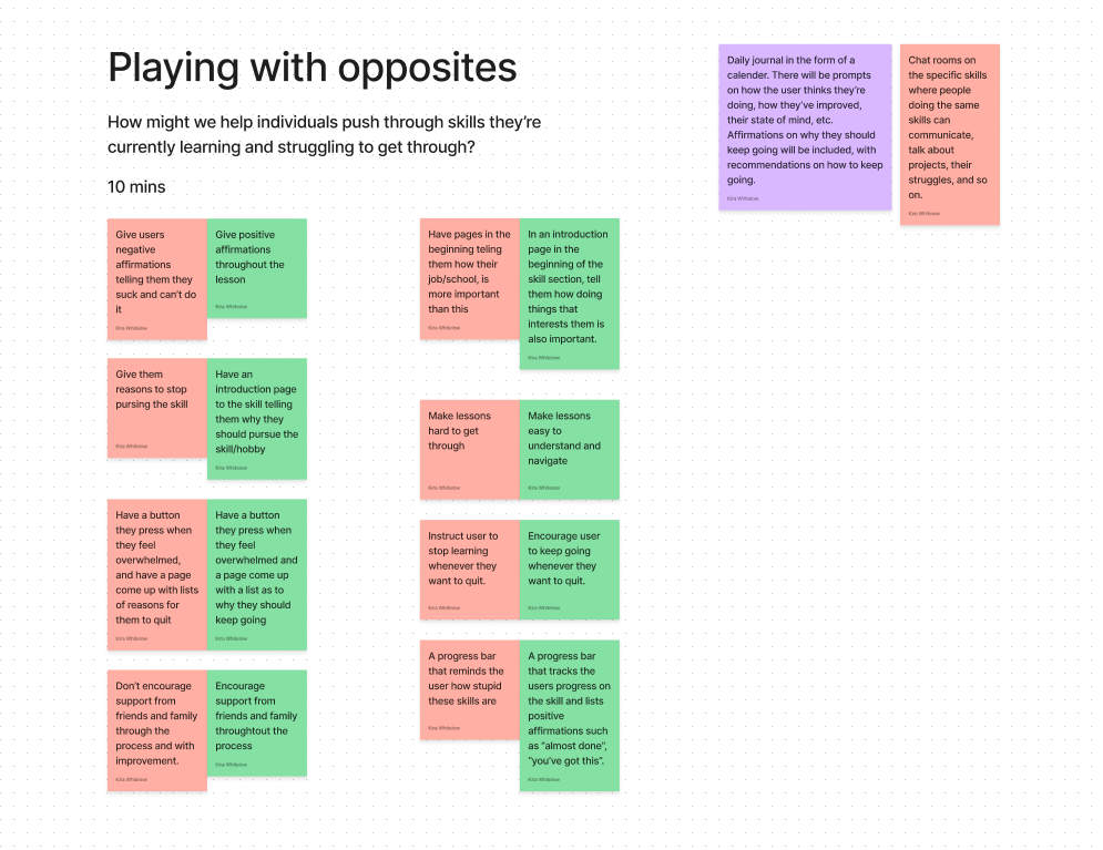
"How might we help individuals push through skills they’re currently learning and struggling to get through?"
User Personas
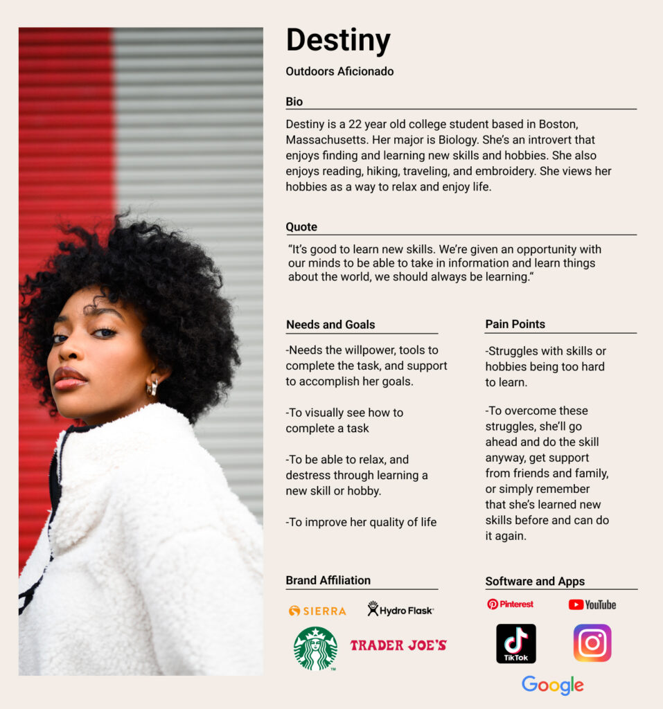
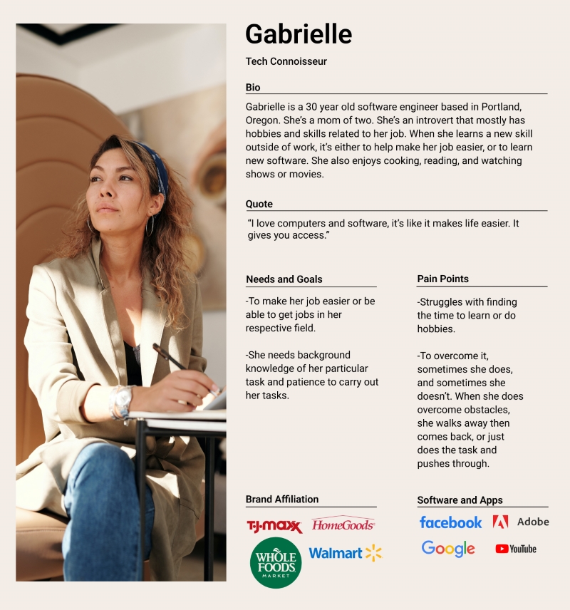
Based on user interviews and the affinity mapping results, I came up with two different personas named Gabrielle and Destiny. Overall, users have issues finding time to learn a new skill or they find the skill too hard and give up. They also need support, background knowledge, and the tools needed to complete a task.
Rapid Ideating
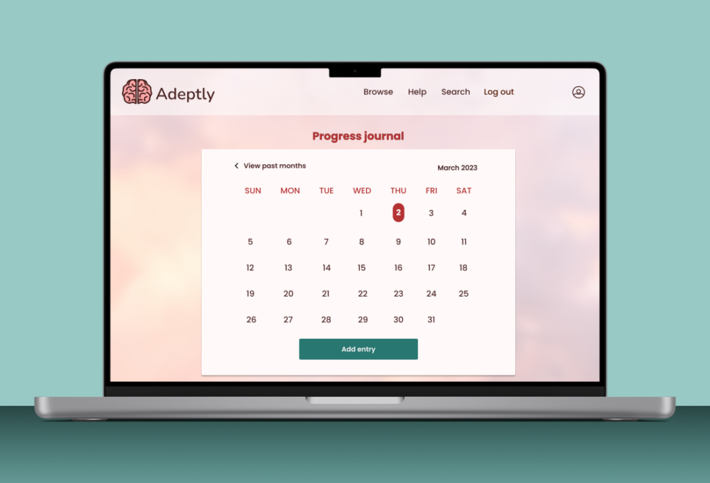
To help me think of ideas quickly, I did two exercises, including creative output constraints, and playing with opposites. Between the two exercises, I came up with two features that I wanted to move forward with. The ideas included the progress journal and skill-specific chat rooms. I ended up choosing the progress journal.
Site Map
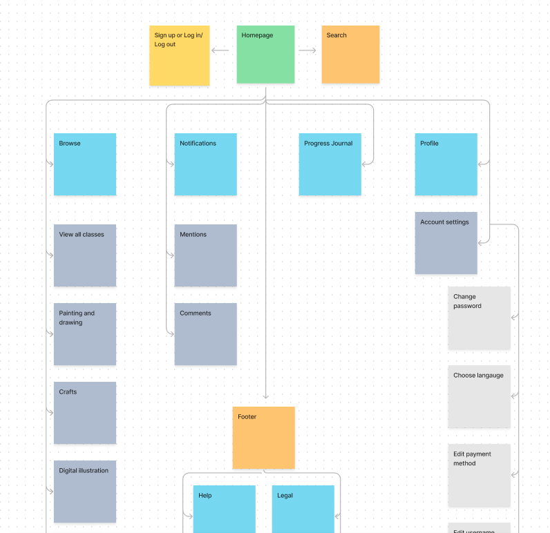
I conducted a card sort to see how users in my target audience would categorize themes, and from there I created a site map to lay out the basic navigation of the website. The sitemap emulates the results from the card sort so that my audience is more comfortable with the navigation.
User Flows
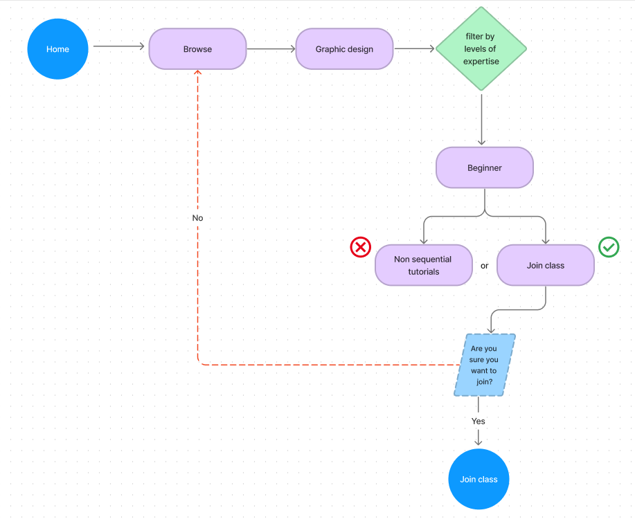
I created user flows for each major flow that I wanted to create and test. This helped to demonstrate how the user would complete a task and showed the options they would have. I made user flows for signing up/choosing a subscription, and choosing a lesson because these are important tasks for the user to perform. Since my users tend to find a task too difficult to learn, I included levels of expertise so that beginners feel less intimidated, but a more advanced user can find something to learn as well. For choosing a plan, I wanted to create affordable plans so that users find the platform more accessible.
Choose a class flow
Task Flows
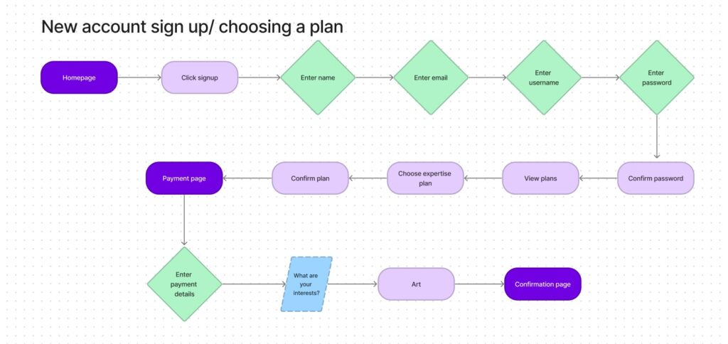
I created task flows for the same flows as well. This helped to further demonstrate how the user would complete a single task and allowed me to hone in on the details of the task. See below for an example.
Low-Fidelity Wireframes
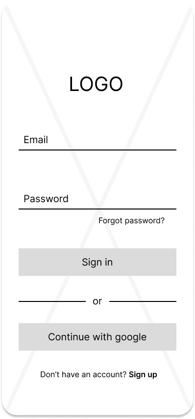
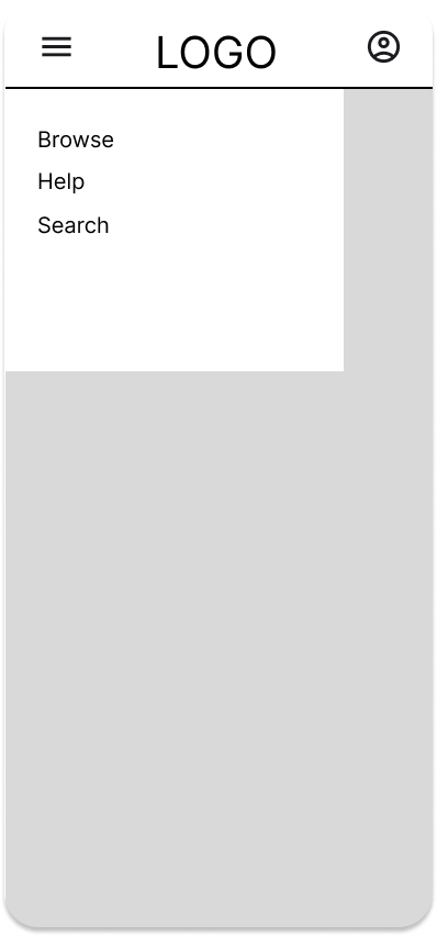
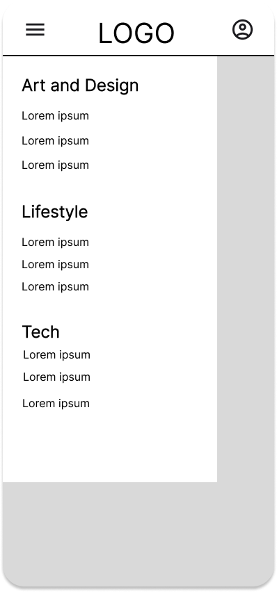
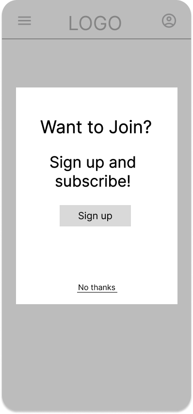
Based on the site map, user and task flows, I created low-fidelity wireframes. One full flow was demonstrated first before moving on to mid-fidelity wireframes. In these wireframes, I wanted to lay out the foundation of the design. I wanted to include a large amount of classes to choose from, without it getting overwhelming.


Mid-Fidelity Wireframes
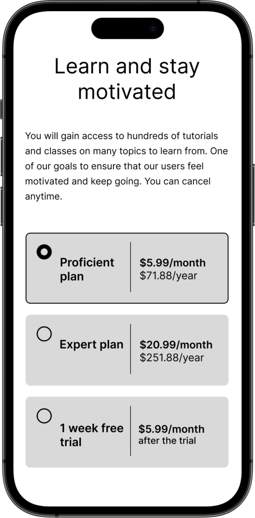
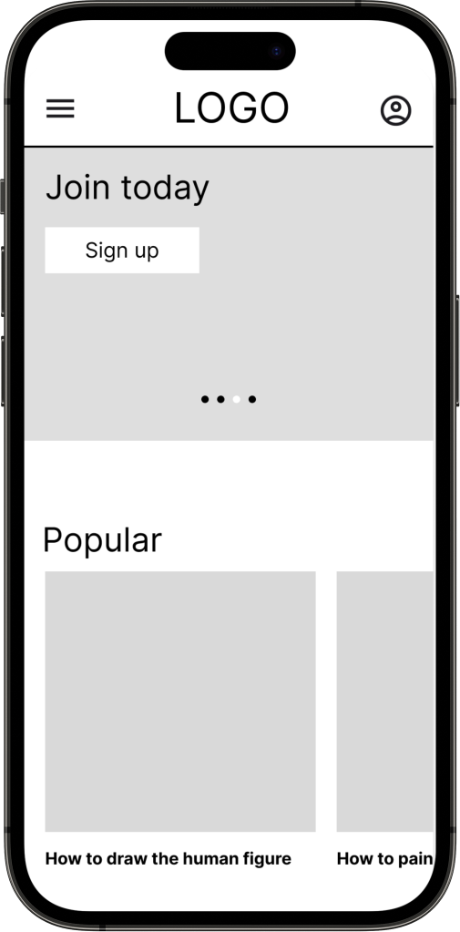
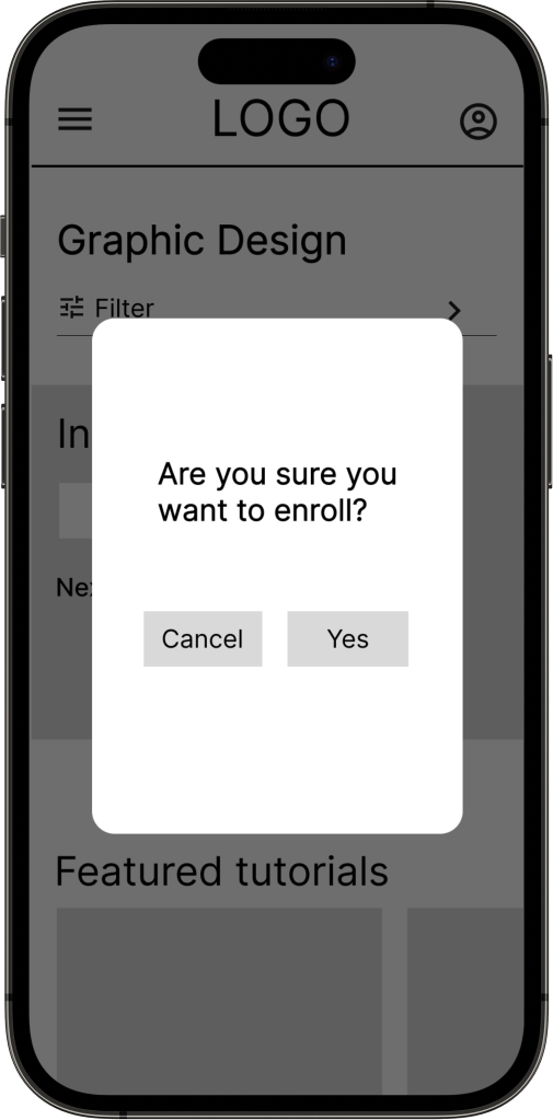
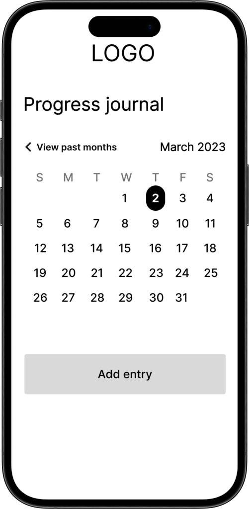
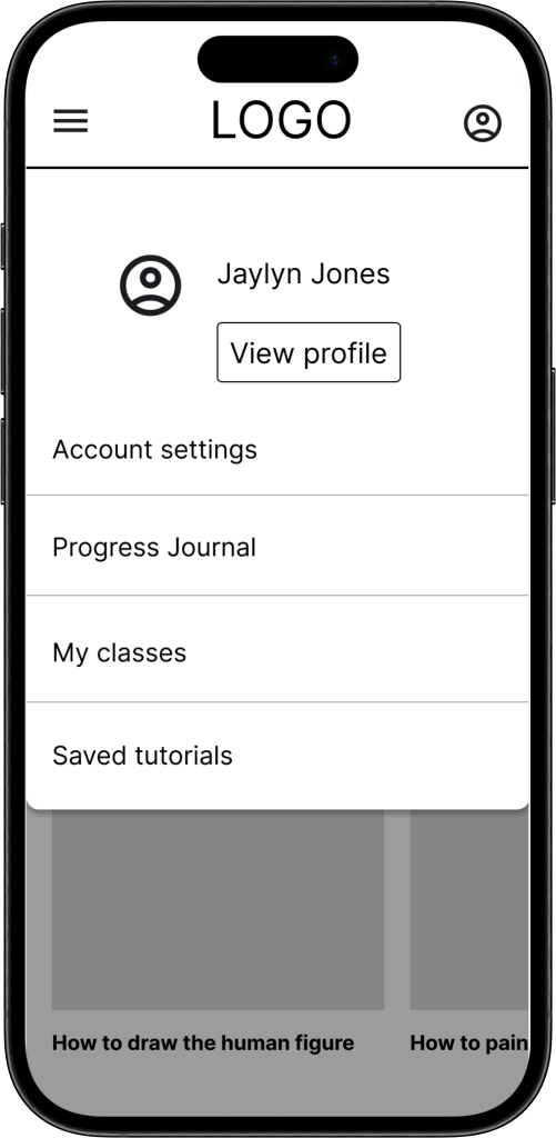
After creating the lo-fi wireframes, I got feedback. Some feedback included the cards on the homepage being too small. Based on that feedback, I brought the wireframes to mid-fidelity.
Branding and UI
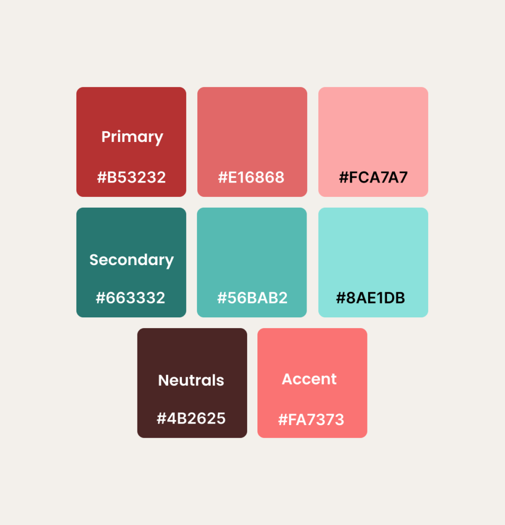
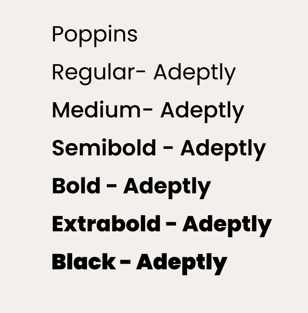
Before moving on to the high-fidelity wireframes, I created the visual identity for the site. Including the branding, logo, color palette, and components. The original color palette was supposed to be monochromatic with different shades of pink, however, the color palette being accessible enough became an issue. Due to that, I added the greens to make the color palette complementary and to add contrast. I wanted the final color palette to be inviting while also evoking feelings of motivation, determination, and confidence, which align with my brand values and audience.
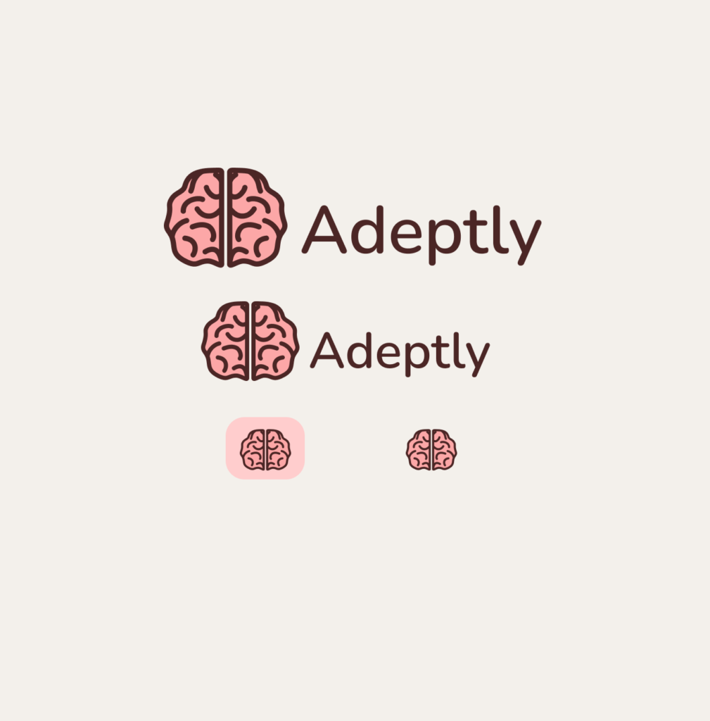
Regarding the logo, since Adeptly is a learning platform, I thought that the logo illustrating a brain would be a good fit. I applied my color palette to the brain, and I created my logo.
High-Fidelity Wireframes and Prototyping
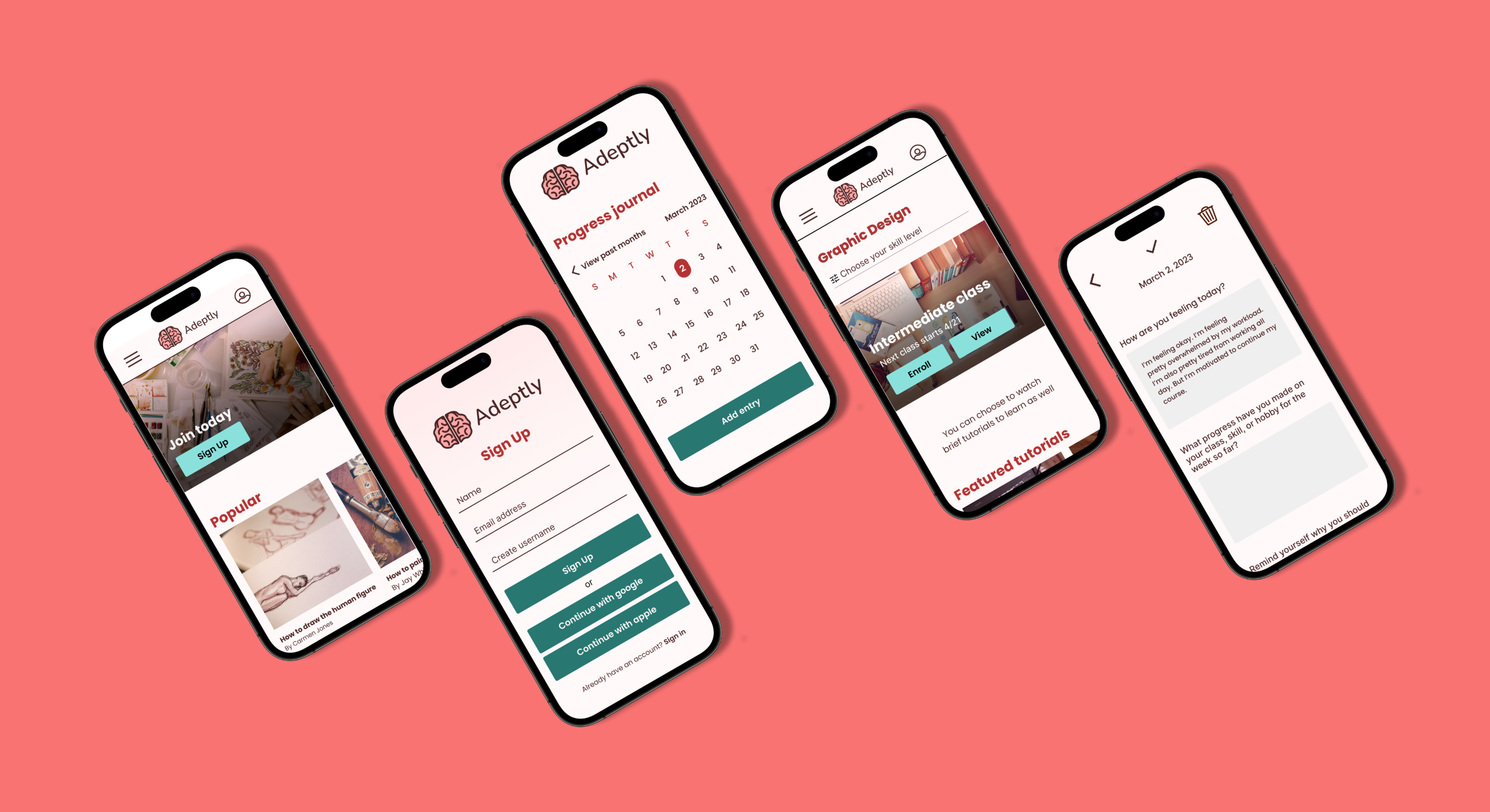
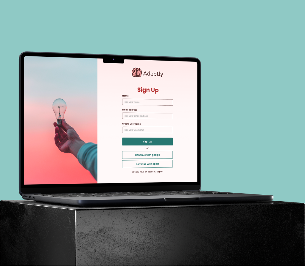
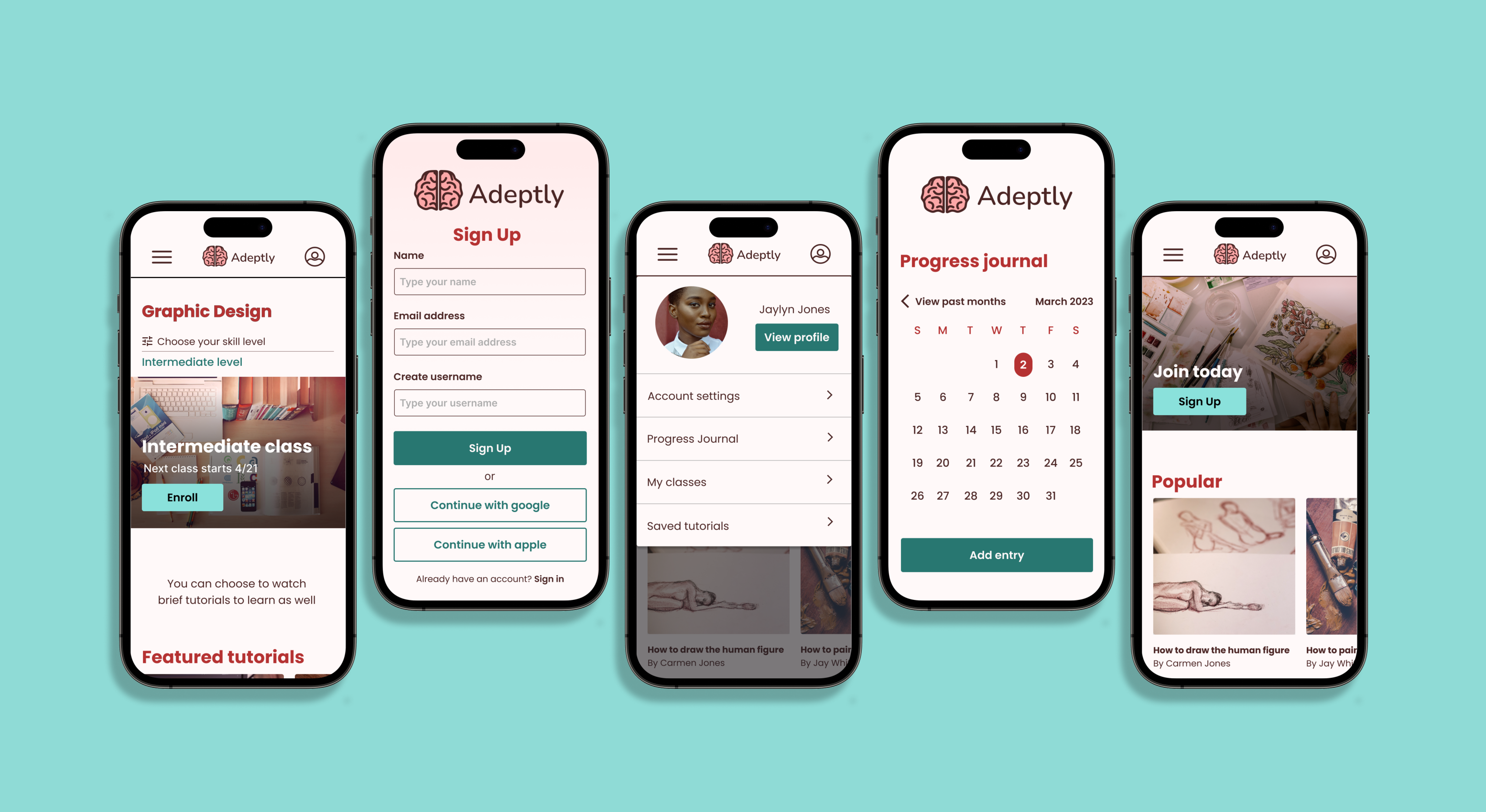
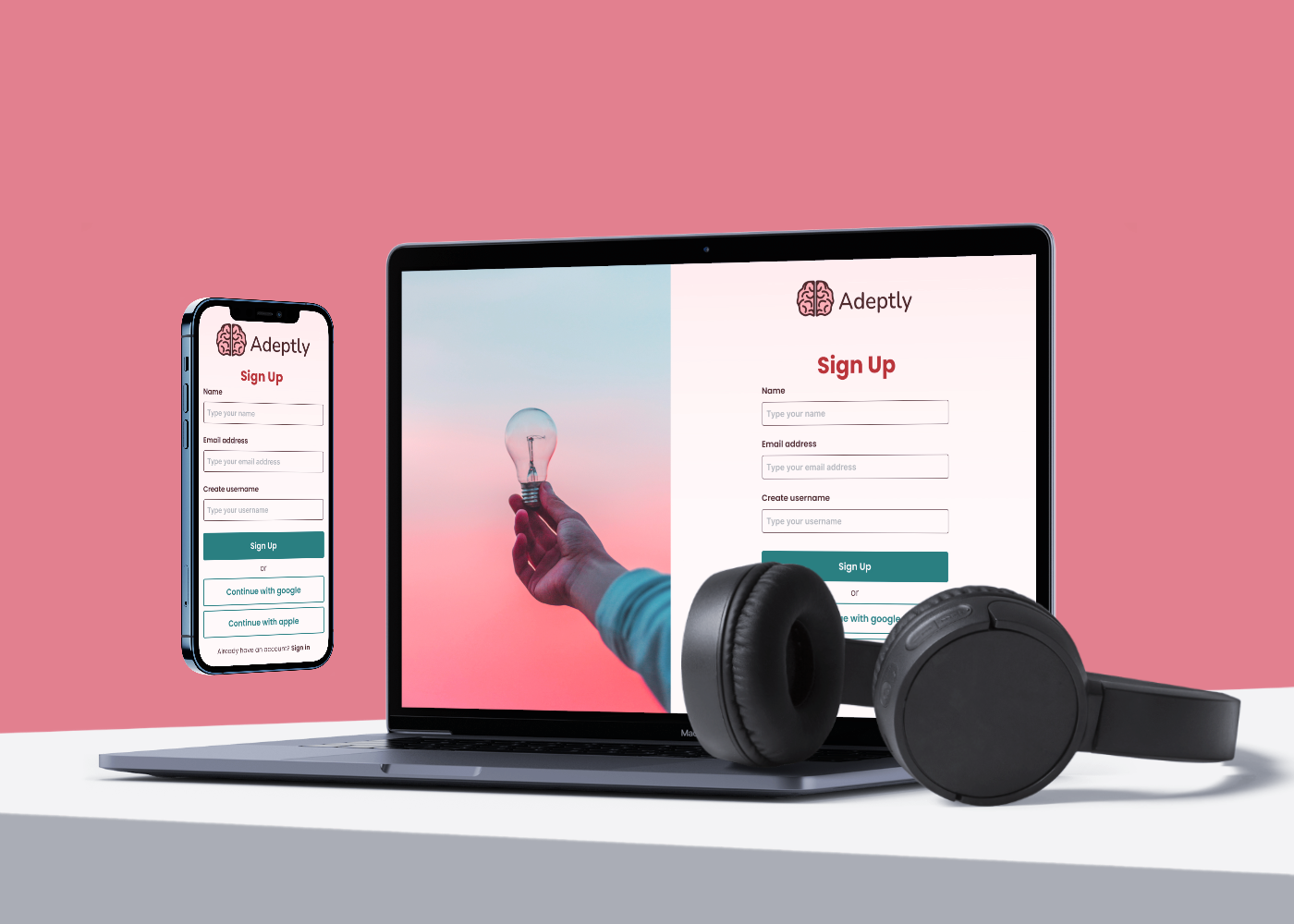
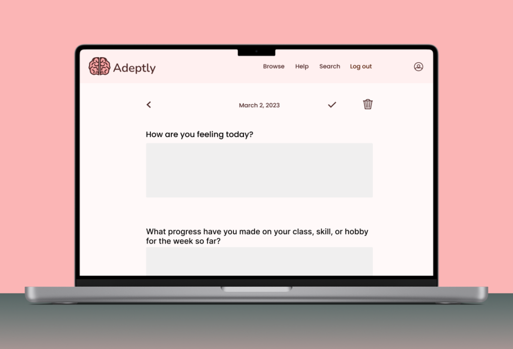
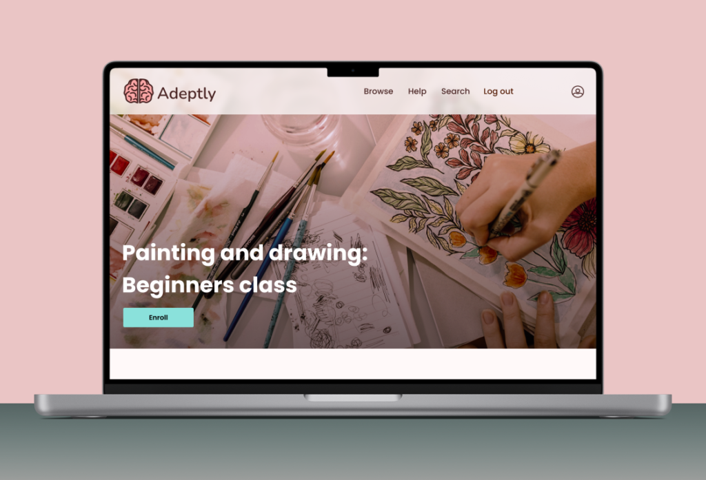
Based on my mid-fidelity wireframes, and feedback, I added the UI design and created high-fidelity wireframes. I wanted there to be a pink hue throughout the website, to represent the brand values. The green colors were used as an accent. From there, I prototyped the product in Figma. I also created desktop screens with the website displayed to show how it would look on a desktop computer.
Usability Testing
5 people ages 20-35 participated in user testing remotely through zoom. Notes were transcribed using Otter. The participants were given scenarios and asked to complete 3 tasks.
Task Flows
- Sign up/Pay for subscription
- Choose a class
- Add an entry to the progress journal.
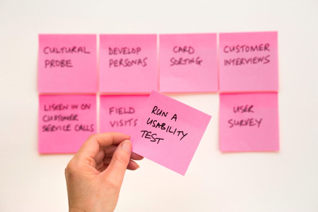
Issues Users Had
- 1/5 participants mentioned that it wasn’t clear that the class skill level was active.
- 1/5 participants didn’t know whether or not to use search or browse.
- 2/5 users had issues finding the progress journal.
- 2/5 users didn’t know they could scroll.
- 3/5 users had issues with the browse link being too small and hard to click.
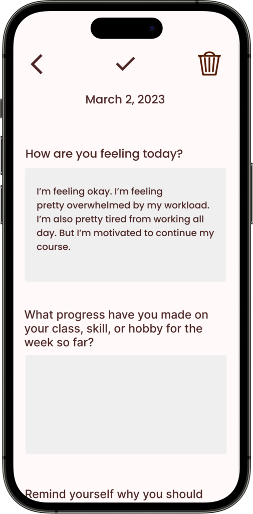
- 5/5 users kept clicking the input boxes in the progress journal not knowing that only the 1st box was clickable.
Usability Testing Results
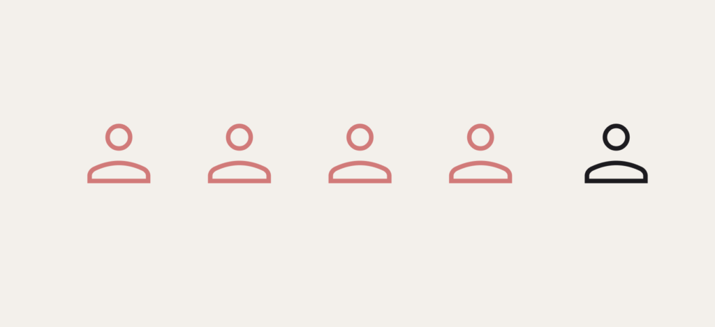
- 4 out of 5 participants finished each task flow in 2 minutes or less.
- 4 out of 5 participants gave their overall site experience a 9 out of 10.
- 4 out of 5 participants gave their overall satisfaction with the site a 9 or a 10 out of 10.
- 3 out of 5 participants said that the site was user-friendly and easy to navigate.
- 4 out of 5 participants said that they found the user interface design to be effective.
Success Metrics
Time: The goal was to have each user finish each task flow in 2-3 minutes or less. All finished in 3 minutes or less.
Satisfaction: The intention was to have the rate of satisfaction be as high as possible. All gave a satisfaction rating of 8 or above on a scale of 1-10.
The completion rate for tasks: The goal was to have all users be able to get through all task flows. All users were able to do so.
The error rate for tasks: The goal was to have an error rate of less than 20% for each task flow. All users had an error rate of 20% or less per task flow.
Revisions
I made revisions based on feedback from user testing. I also made revisions based on group critiques and mentor feedback.
Before
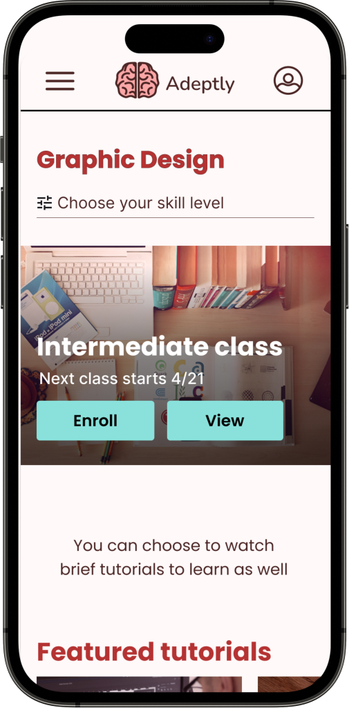
After
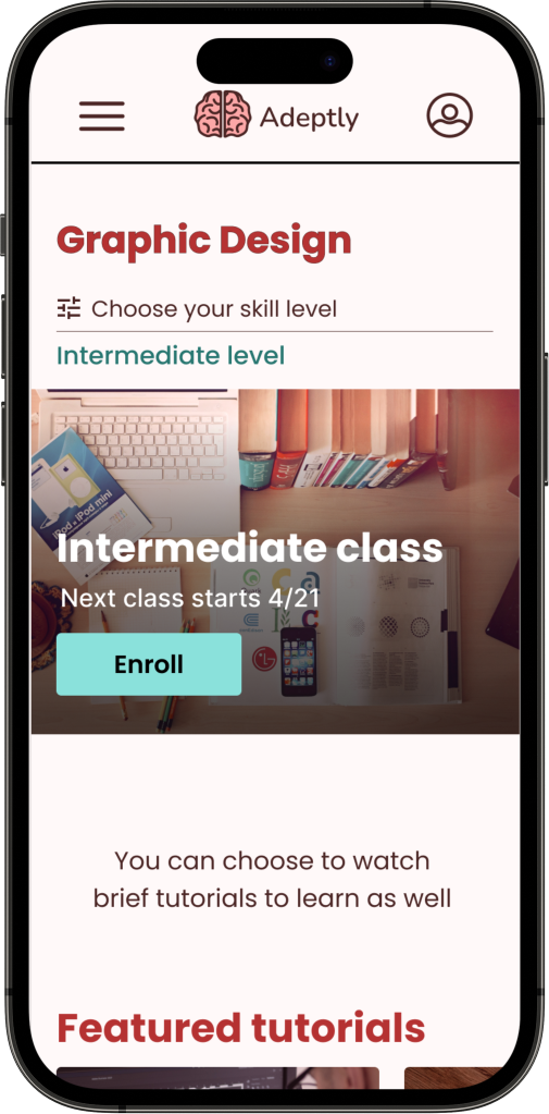
For choosing a class flow, one of the user testing participants suggested that I put in the level they chose at the end of the flow.
Before
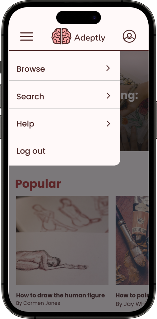
After
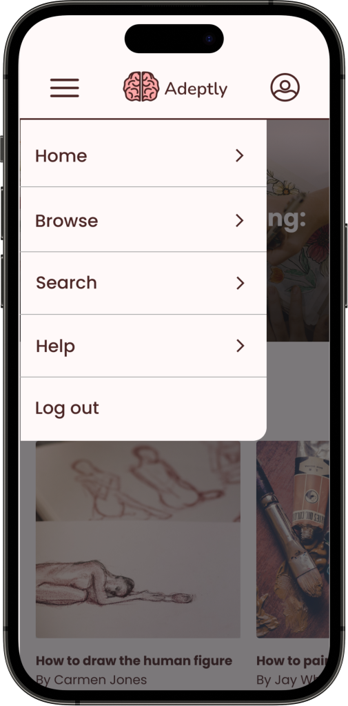
Based on user testing, I put a link to the homepage in the side menu for people who might miss the logo.
Before
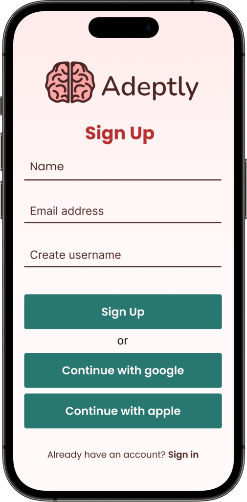
After
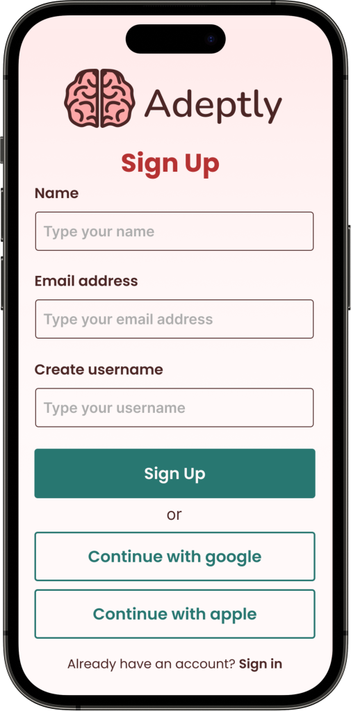
I made the input boxes match the others throughout the website for consistency. I also made the google and apple links a different color to create a hierarchy.
Before
After
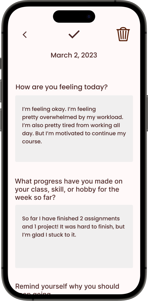
During user testing, I had it to where the user could click any of the boxes and it filled in just the top box, and then they were done. However, this confused all of my users. Due to this, I made it so that they could click a box and it would fill all of the boxes with text, so they aren’t confused and know that they’re done with that part of the flow.
Conclusion
I learned a lot from this project, and I’m glad that I got to work on a project like this. It was challenging trying to figure out what classes I would include and how the interface would look. However, through research, and testing, I was able to achieve my goals for the project and figure out what to do. I learned so much about responsive website design, branding, UI, research, and so on. Furthermore, with the feedback I got from testing, I was able to improve the prototype greatly and make it easier to navigate. I’m happy that overall, the product is user-friendly. During user testing, a few people mentioned how this would be a good app for them to use and that the progress journal was a good way to motivate them. I’m glad I was able to make a website prototype that people would enjoy in real life.
Next Steps
If I had more time, I would spend more time on the prototyping animations and hovers.
