Netflix: Show Selector
Type
Feature added to an existing app.
Role
UX/UI Designer
Tools
Figma, pen, and paper
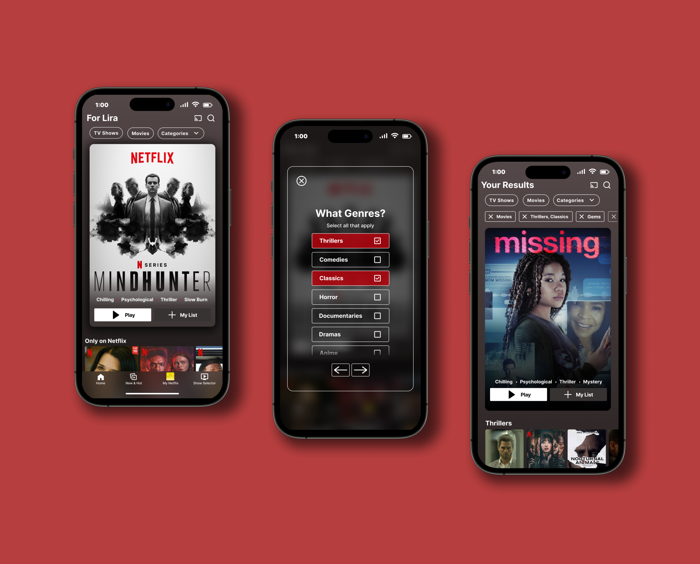
Netflix is one of America’s most popular streaming services, and it keeps viewers coming back with its extensive selection of movies and TV shows. However, there is room for improvement to gain a better experience for the user. The “Show Selector” feature was created to allow users to quickly pick out a movie or show that interests them. They have the opportunity to narrow down their options so that they are not overwhelmed by the variety of movies and TV shows.
Empathize
Research Ramp-Up
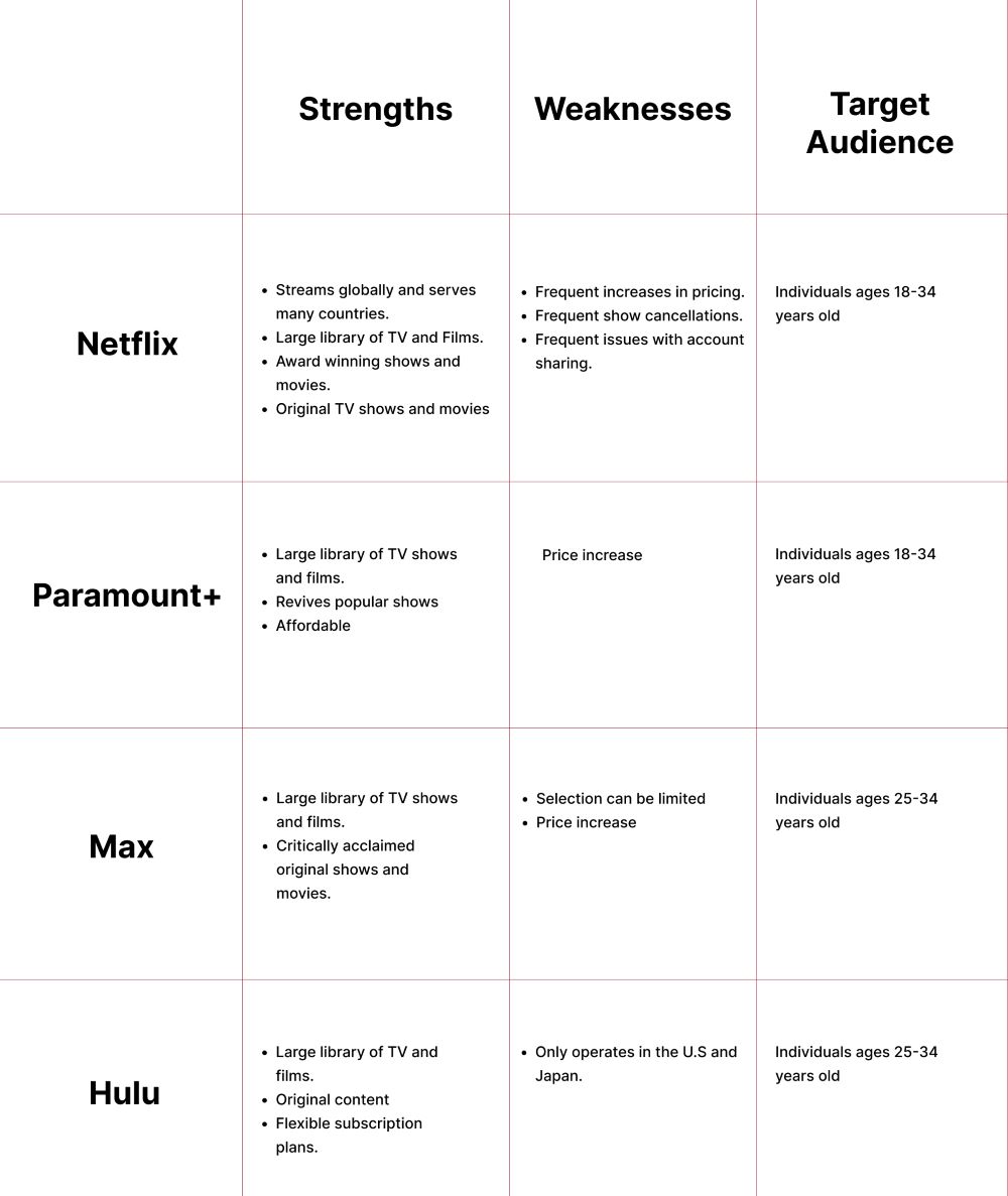
One of the first things I decided to do was a competitive analysis. I did the competitive analysis to see the competitors target audience, mission statements, pricing, strengths, and weaknesses. After that, user interviews were done to figure out users experiences with Netflix, their pain points, and the problem.
User Interviews
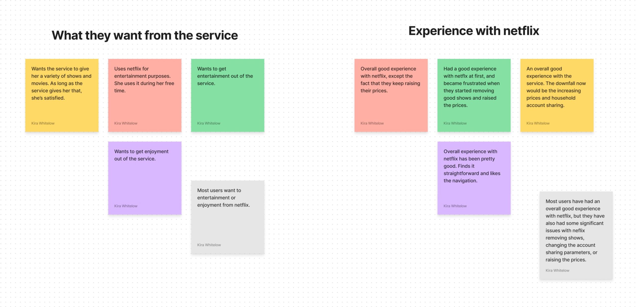
4 participants between the ages of 20-35 were interviewed. The results were then compiled into affinity maps to help me see trends.
Results
- 2 out of 4 participants purely want to get entertainment out of the service.
- 4 out of 4 participants have had an overall good experience with Netflix.
- 3 out of 4 participants reported issues with Netflix’s account-sharing system and the constraints Netflix has for sharing an account within a household.
- 4 out of 4 participants use Netflix on their TV. 1 participant also uses it on her phone.
- 3 out of 4 participants have problems finding something good to watch on Netflix.
2 out of 4 participants enjoy the watchlist feature. 1 participant enjoys the Netflix originals and the other uses Netflix instead of cable.
Define
How Might We?
Point of view and how might we statements were put together based on the affinity mapping results. One statement was chosen that would be the main issue this feature would solve.

User Personas
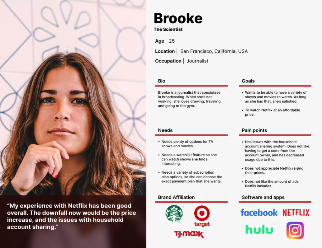
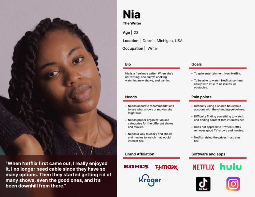
Based on user interviews and the affinity mapping results, I came up with two different personas named Nia and Brooke.
Overall, users need a way to easily find shows to watch and plenty of options for TV shows and movies. Some of their pain points also include Netflix removing TV shows that they like, raising prices, issues with household account sharing, and finding something good to watch.
Ideate
Rapid Ideating
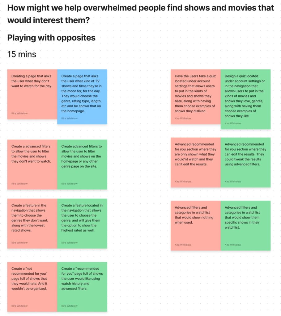
To help me think of ideas quickly, I did an exercise called “playing with opposites”. Through this exercise, I came up with the show selector feature.
Prototype
User Flow
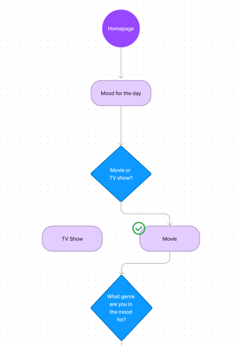
I created a user flow for the feature I wanted to create and test. This helped to demonstrate how the user would complete the task and it showed the options they would have. This method made it very easy to lay out the foundation of the feature. The flow is based on how users go about finding something to watch and their thought process.
Low-Fidelity Wireframes
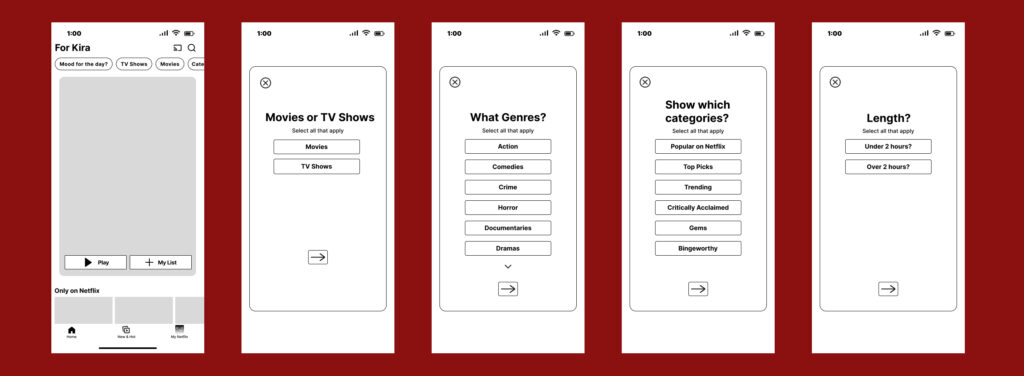
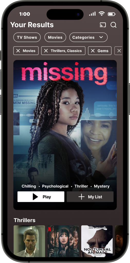
Based on the user flow, I created low-fidelity wireframes. The full flow was demonstrated first before moving on to mid-fidelity wireframes. With the show selector quiz, I wanted to enable the user to hone in on what they really want to watch, to cut time on looking.
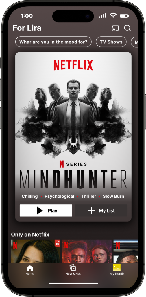
At first, I had the feature under categories and the name was “what are you in the mood for?”.
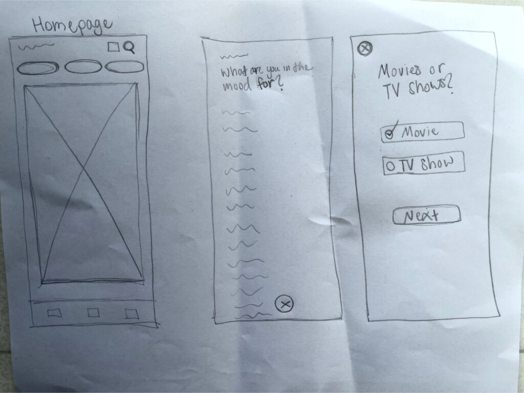
I also wasn’t sure about the side by side lay out of the genres. In these sketches, I was mostly trying to get my idea out on paper.
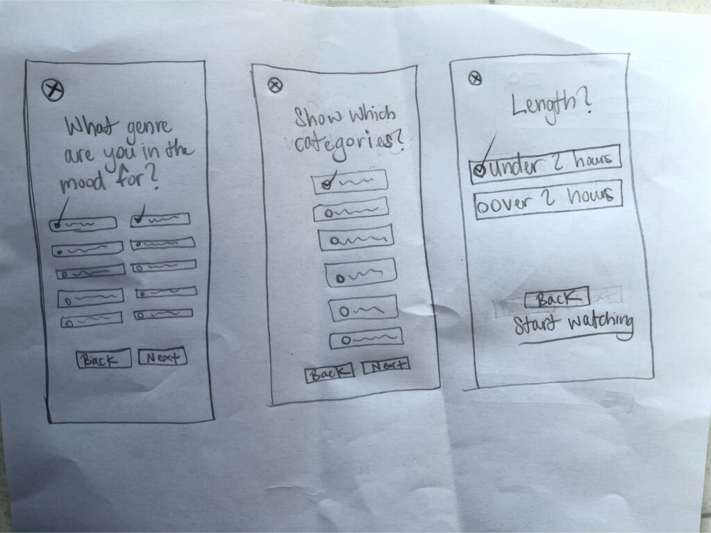
Mid-Fidelity Wireframes
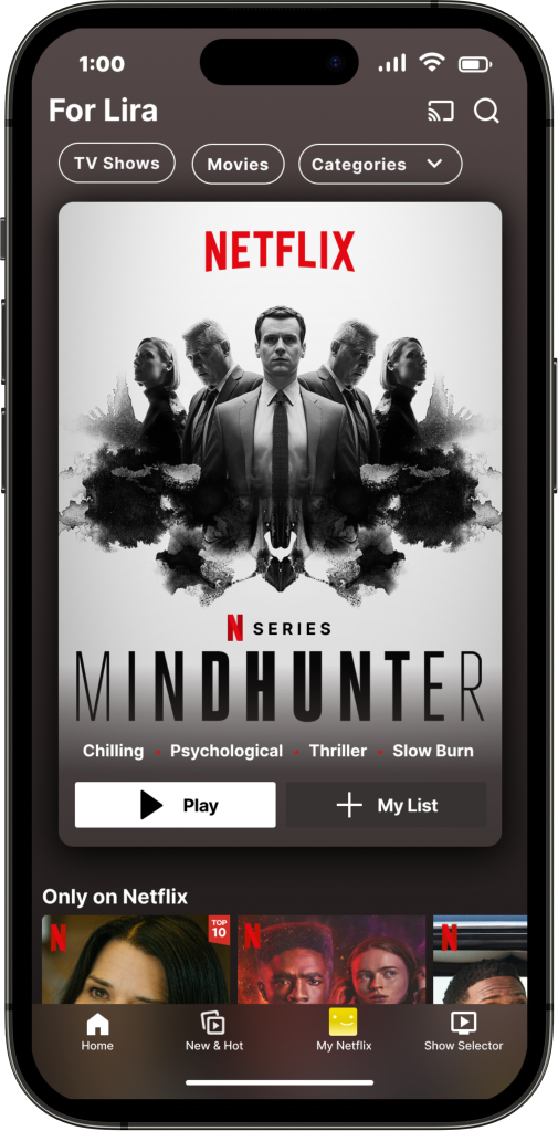
After creating the low-fidelity wireframes, I created the mid-fidelity wireframes. I did my best to closely match Netflix’s branding and content.
High-Fidelity and Prototyping
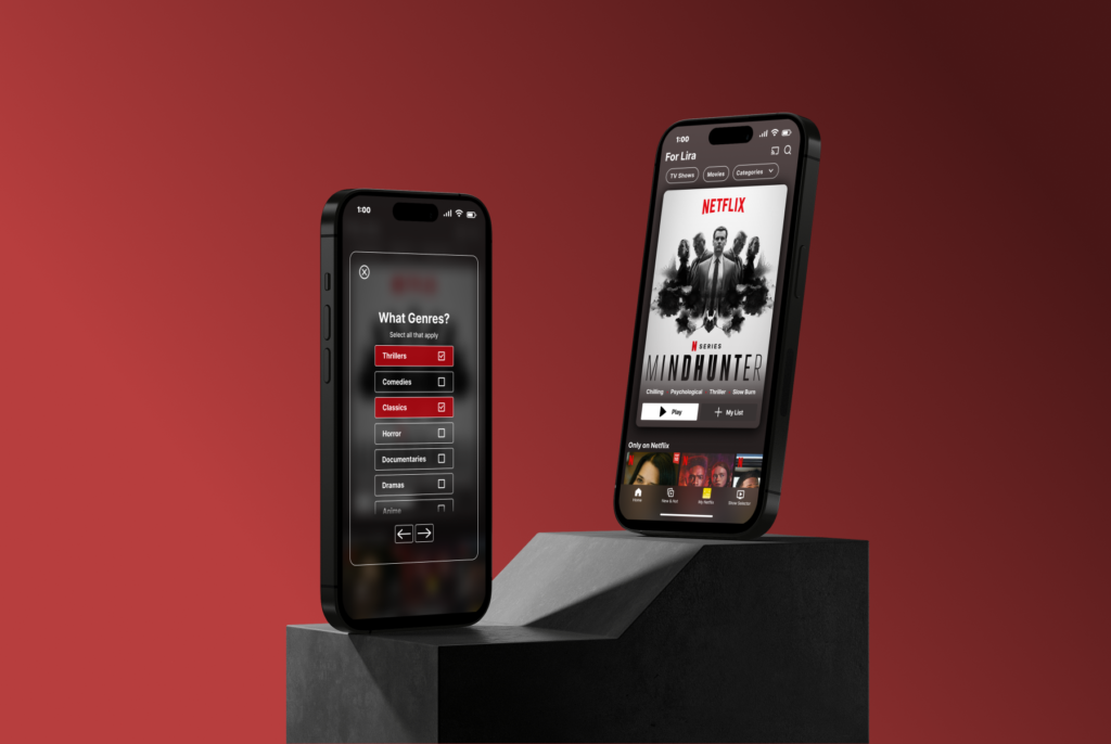
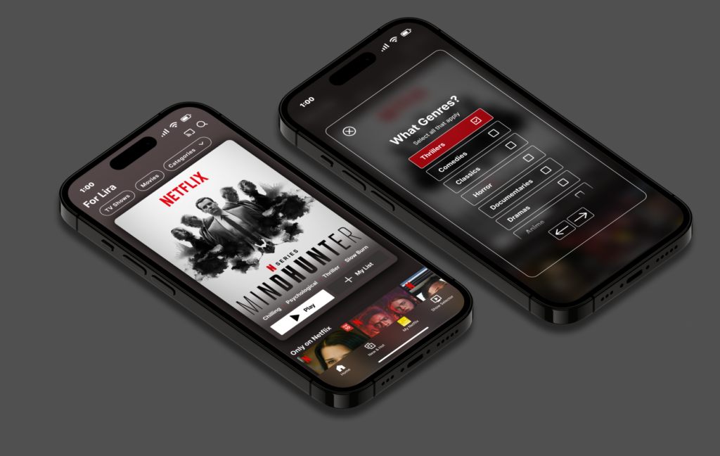
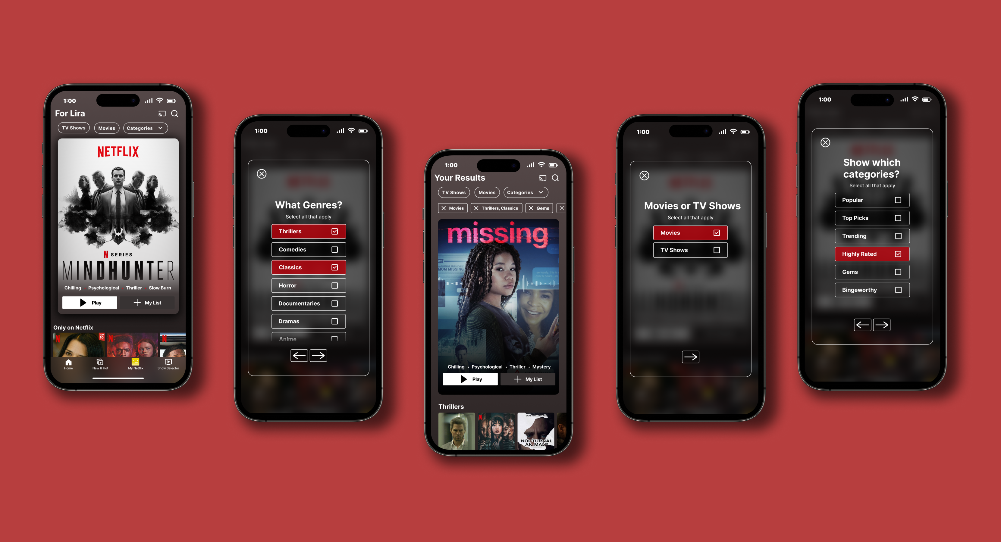
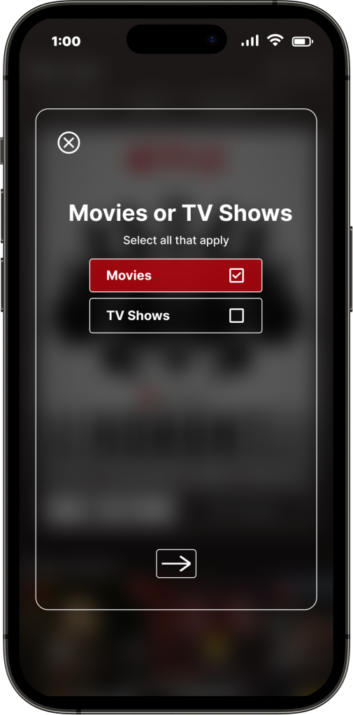
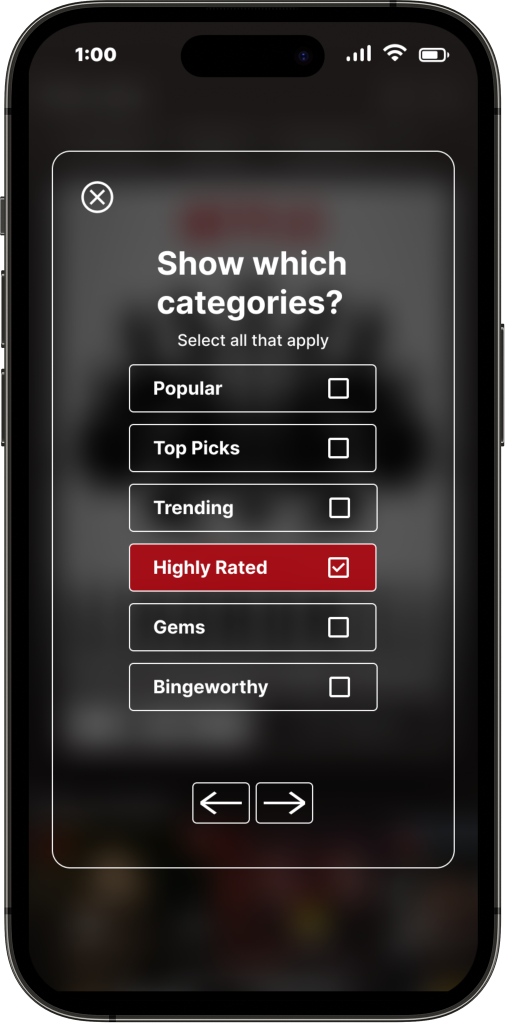
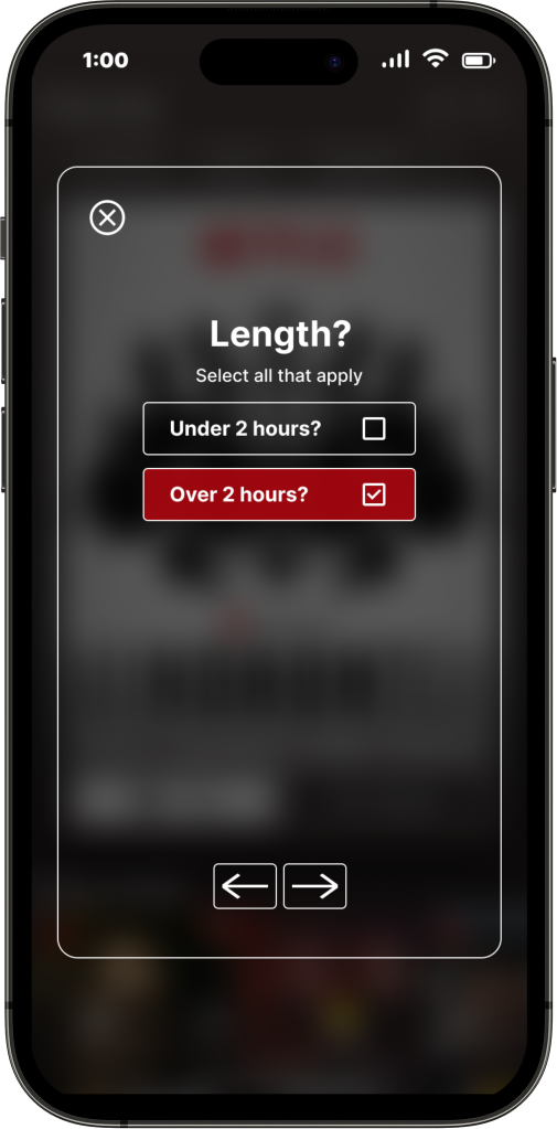
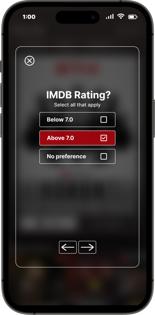
Based on my mid-fidelity wireframes, and feedback, I created high-fidelity wireframes. And from there, I prototyped the feature in Figma. For the quiz screens, I made sure to keep the same color palette Netflix uses, using red and black. To make the quiz feel more familiar, I also let the homepage background show through the quiz background.
Overall, I wanted to keep the same feel Netflix has. To emulate that, I kept the backgrounds dark and used a similar style of buttons Netflix uses.
Test
Usability Testing
5 people ages 20-35 participated in user testing remotely through zoom. Notes were transcribed using Otter. The flow was broken up into two parts.
Show Selector Task Flow
1 task flow was created to test to align with the one feature I created. See below for the scenarios. I broke it up into two parts to make it easier to get through for users.

Usability Testing
- 5/5 participants got through the task flow in less than a minute.
- 5/5 participants gave their overall rate of satisfaction a 9 or above. All but one were 10’s.
- 4/5 participants gave their overall experience a 10.
- 5/5 participants felt that the flows were easy to get through and straightforward.
- 5/5 users had no difficulty getting through the flow.
- 5/5 users felt that the feature would be helpful and would make finding something to watch on Netflix easier.
Success Metrics
Time: The goal was to have each user finish the entire task flow in under 3 minutes. All finished in less than 1 minute.
Satisfaction: The goal was to have all users be satisfied and give a high rating. All users gave a rating of 9 or above. Most gave 10’s.
The completion rate for tasks: The goal was to have all users be able to get through the flow. All users were able to do so.
The error rate for tasks: The goal was to have an error rate of less than 20% for the task flow. I would say that the error rate was below 5%.
Iterate
Revisions
I made revisions based on user testing. I also made revisions based on group critiques and mentor feedback. There wasn’t much to change based on the user testing, however, there was still something to improve. See below for what was changed.
Mid Fidelity wireframes
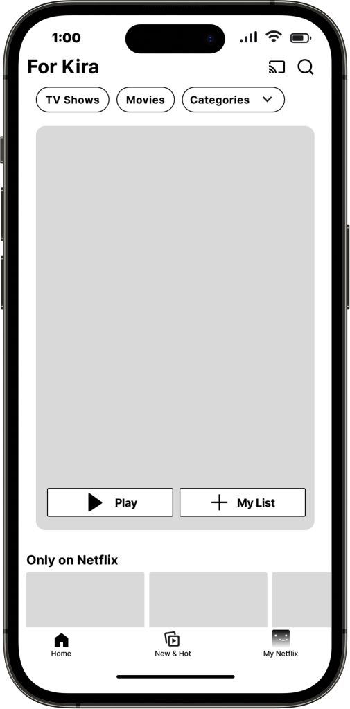
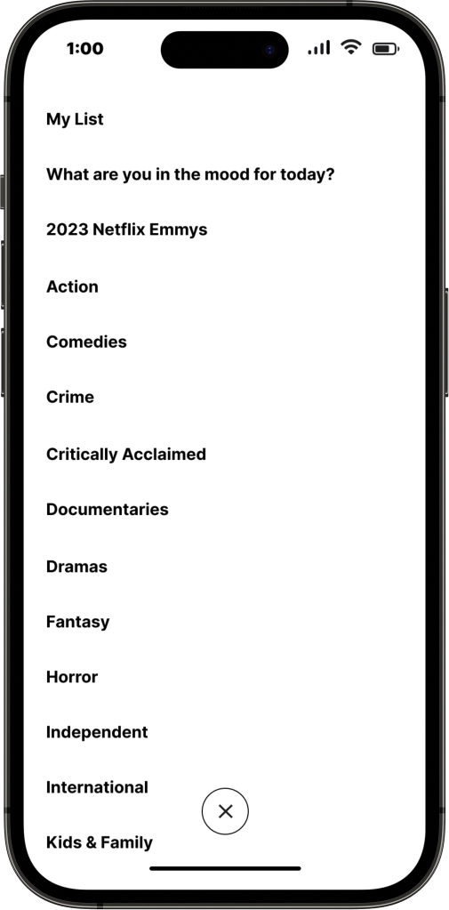
At first, I was going to put the feature under categories, this way, I felt that the feature would blend in with the rest of the app. However, doing it this way, my feature wouldn’t be very noticeable.
Version 1- High Fidelity wireframes
Version 2- High Fidelity wireframes
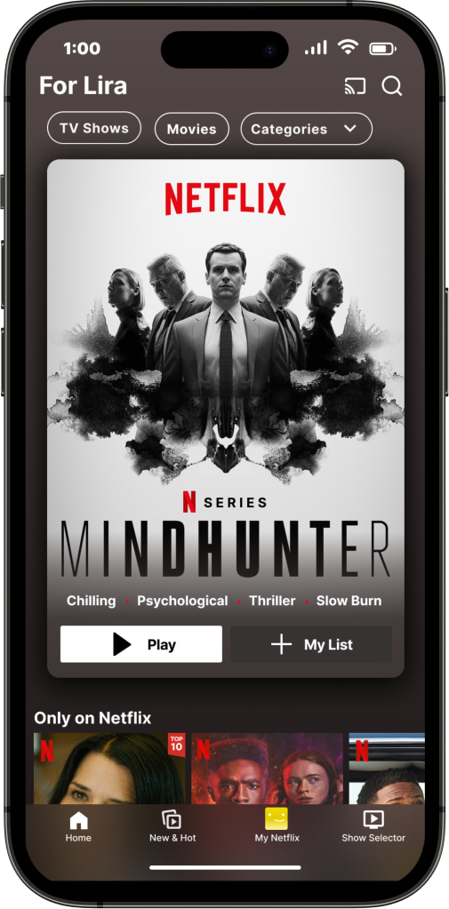
Based on feedback, I made the feature more noticeable. I put it with the tabs at the top of the screen. From there, based on more feedback I received from group critiques, having the feature like this is unexpected, and blended in too much with the other tabs that have a very different function from my feature.
Based on that, I decided to place the feature at the bottom of the screen, with the icons.
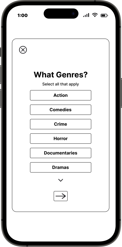
Mid Fidelity wireframes
Version 2- High Fidelity wireframes
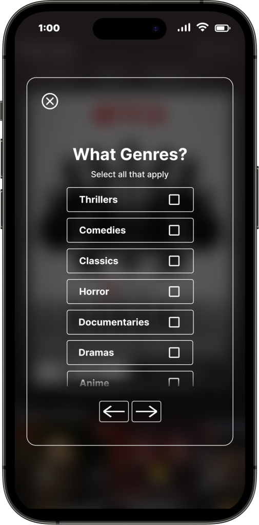
At first, I wasn’t sure how I was going to indicate to users that they can scroll through the list of genres. I put the arrow at the bottom to indicate that, but it felt out of place to me.
Based on that, I decided to cut off the last genre and blur the bottom to indicate that there’s more options. I also added a back button so that users can go back if they need to.
Version 1- High Fidelity wireframes
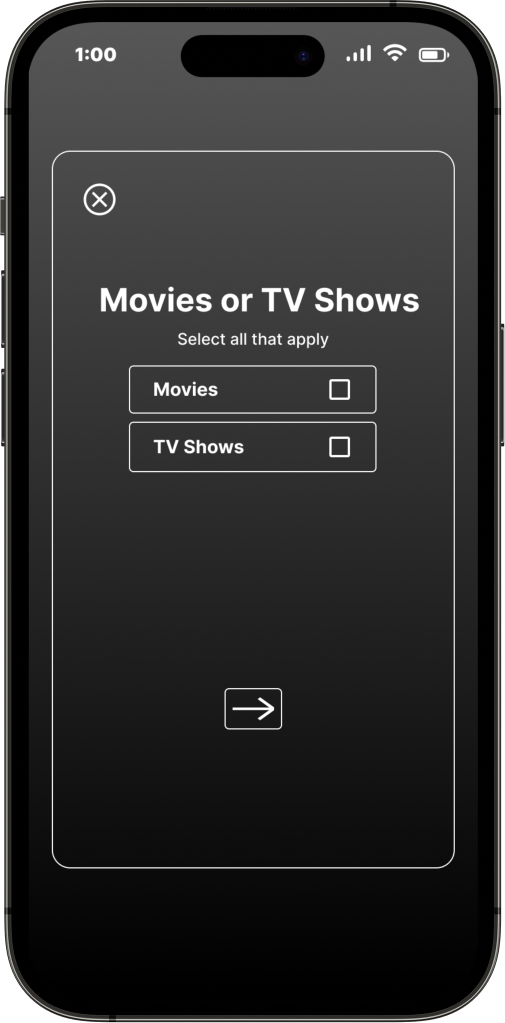
Version 2- High Fidelity wireframes
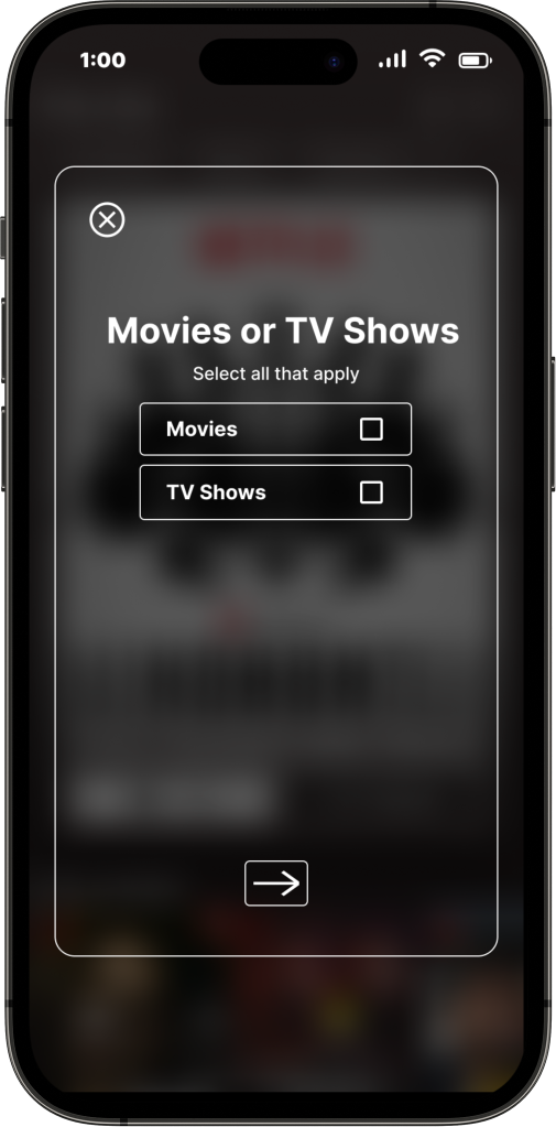
During group critiques, people felt that the gradient background felt too different from the rest of the app. So they suggested making the background, the homepage, but with a dark and blurred overlay.
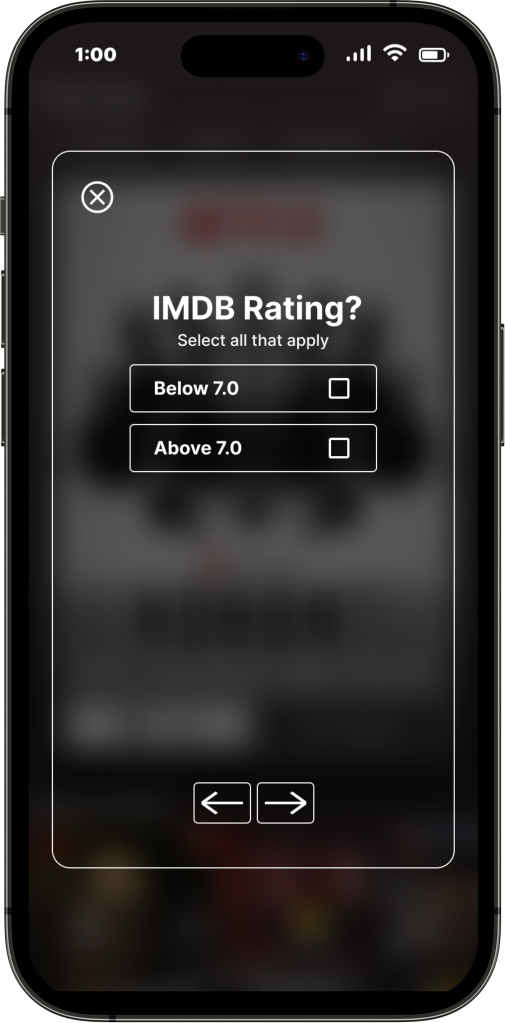
They also pointed out that I need to make sure that the next buttons positioning was consistent.
Version 2- High Fidelity wireframes
Version 3- High Fidelity wireframes
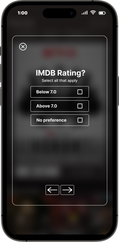
During user testing, one of the participants asked a good question. It was, “what if a movie or TV show on Netflix doesn’t have a rating? There are a few shows/movies on Netflix that aren’t rated by IMDB. So therefore, it would not show up in the results. Also, what if someone doesn’t have a rating preference?
Based on that, I decided to add a “no preference” option.
The Final Design
Conclusion
This project was a great way for me to gain a full understanding of how to incorporate a feature into an existing product. I’m happy and excited about how this feature turned out! The biggest challenge I had was trying to match the feature and blend it in with Netflix’s branding, and components they already use. It was especially hard because they don’t have check boxes or anything like that on their website or app. So I had to find a way to make different elements blend in with their app. However based on this, I was able to figure it out. I’m also happy with the user testing, and the results from that. Everyone had a good experience, and feel that it would be helpful for users to help them find show or movies they’re interested in.
Next Steps
If I had more time, I would consider the following:
- Add more advanced options to make the experience more specialized.
- Do more research on what else I could add to the feature.
