Headway
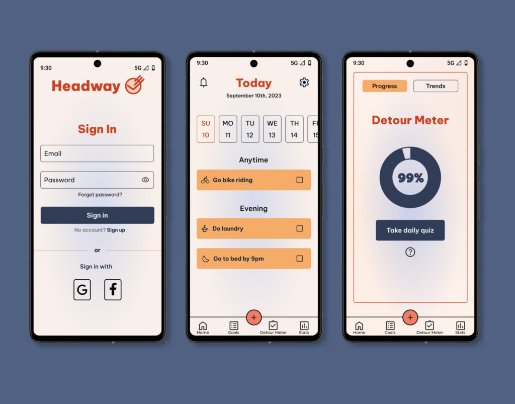
In today’s society, many individuals are busy and struggle with meeting their goals. These goals can include going to bed on time, eating by a certain time, cleaning, going to the gym, and so on. People can also procrastinate due to life struggles. Headway is meant to target these issues by allowing the user to create and complete tasks and use the detour meter to hold themselves accountable.
Type
End to end application
Role
UX/UI designer
Tools
Figma, pen, and paper
Empathize
Research Ramp-Up
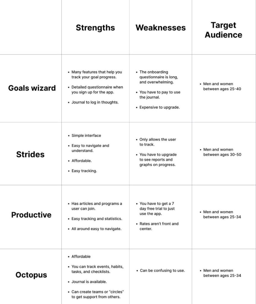
Some of the first things I decided to do was a competitive analysis and user interviews. I did the competitive analysis to see goal setting app competitors, their target audience, mission statements, pricing, strengths, and weaknesses.
After finishing the analysis, I realized that there was an opportunity to create an app that was simple, while also giving the user the option to use many features for free. After that, user interviews were done to figure out user’s experiences with setting goals, their pain points, and the problem.
User Interviews
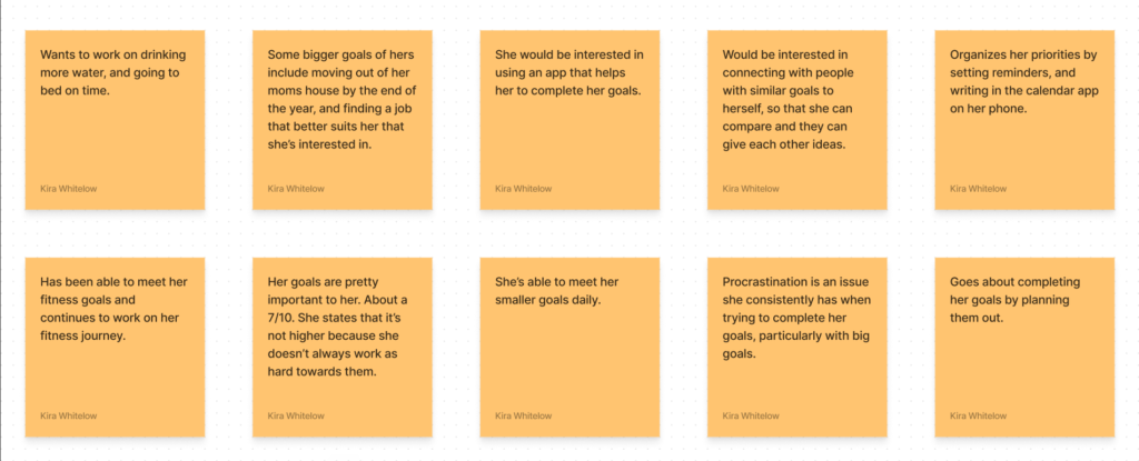
4 participants between the ages of 21-35 were interviewed. The results were then compiled into affinity maps to help me see trends and make insights.
User Interview Results
- 4 out of 4 participants are able to meet their goals to a degree, but they have difficulty meeting a few or are in the process of meeting some of their goals.
- 3 out of 4 participants have tools they use for setting goals and planning.
- 3 out of 4 participants mentioned that procrastination is an issue for them.
- 2 out of 4 participants overall want to drink more water in a day. They also want to make better lifestyle choices like eating more fruits and vegetables and going to bed at a good time. The other 2 are more focused on getting things done before going to class or work.
4 out of 4 participants have big goals that are career-based. 2 focus on advancing their careers, and the other 2 are focused on moving, and finding a job that suits them.
Define
How Might We?
Point of view and how might we statements were put together based on the affinity mapping results. The how might we statements help me hone in on the main issue users have. One HMW statement was chosen that would be the main issue this app would solve.
“How might we help goal-conscious people meet more of their goals and limit procrastination?”
User Personas
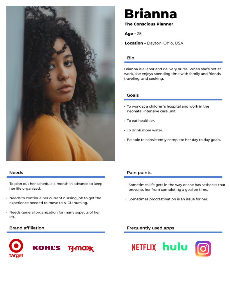
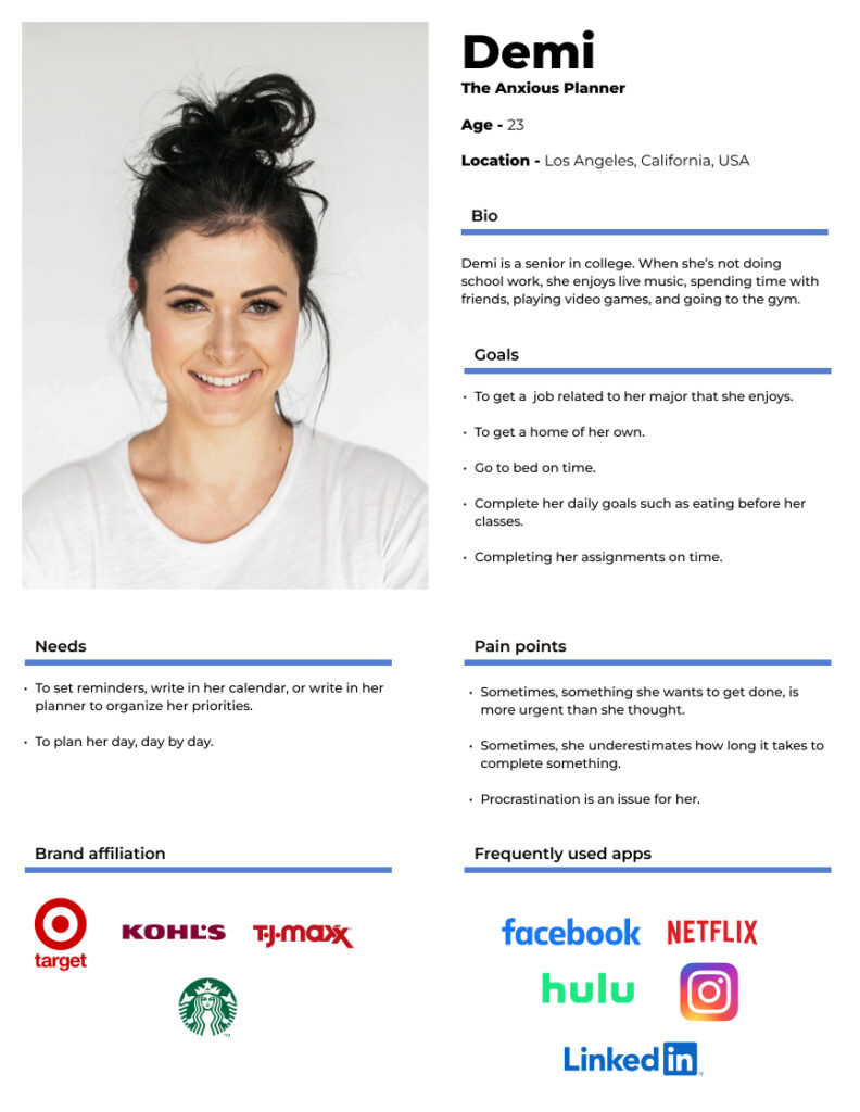
Based on user interviews and the affinity mapping results, I came up with two different personas named Brianna and Demi. Generally, they want to gain more healthy habits and procrastinate less.
Ideate
Brainstorming
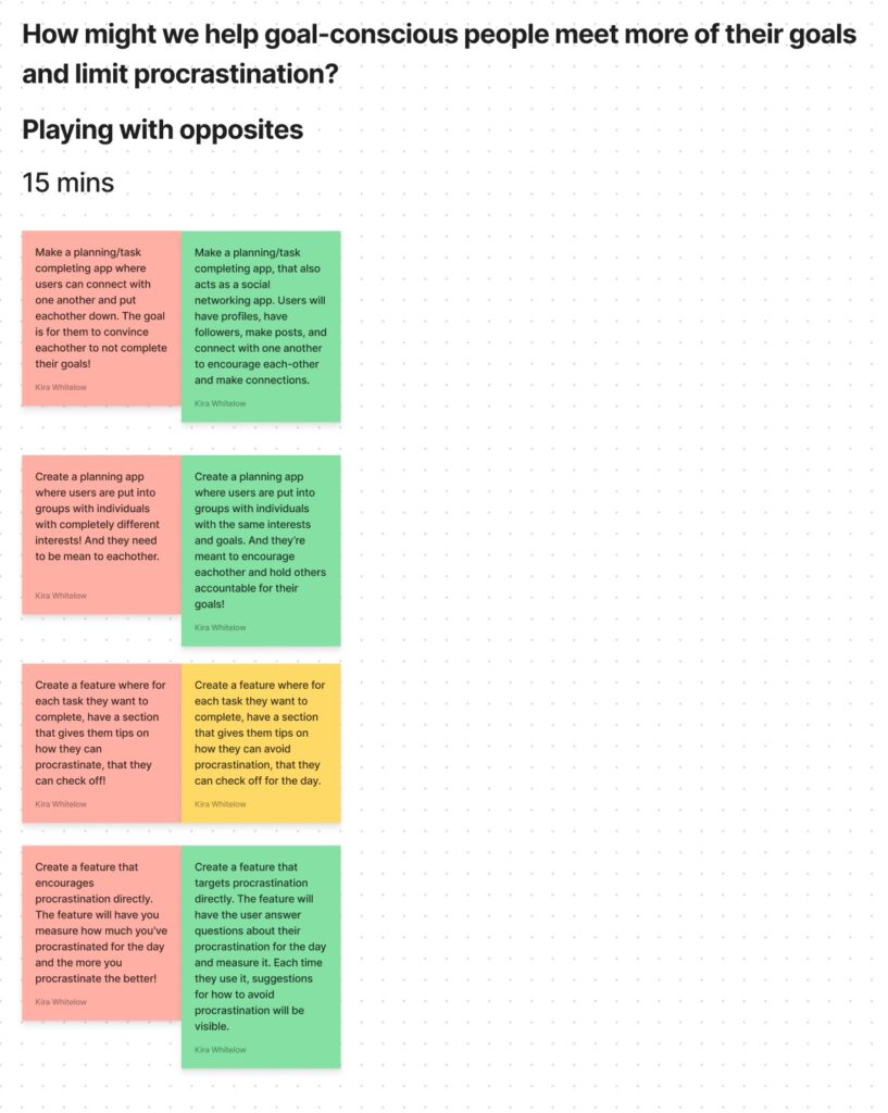
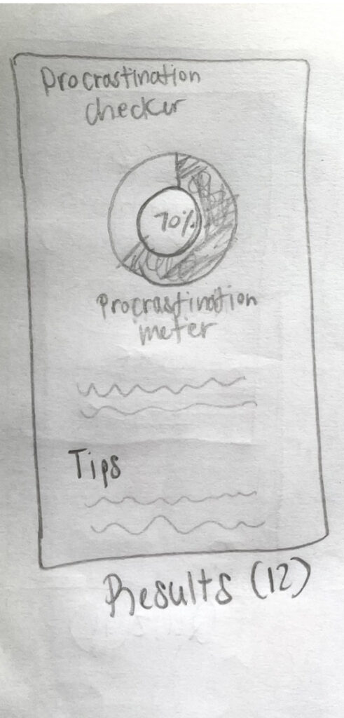
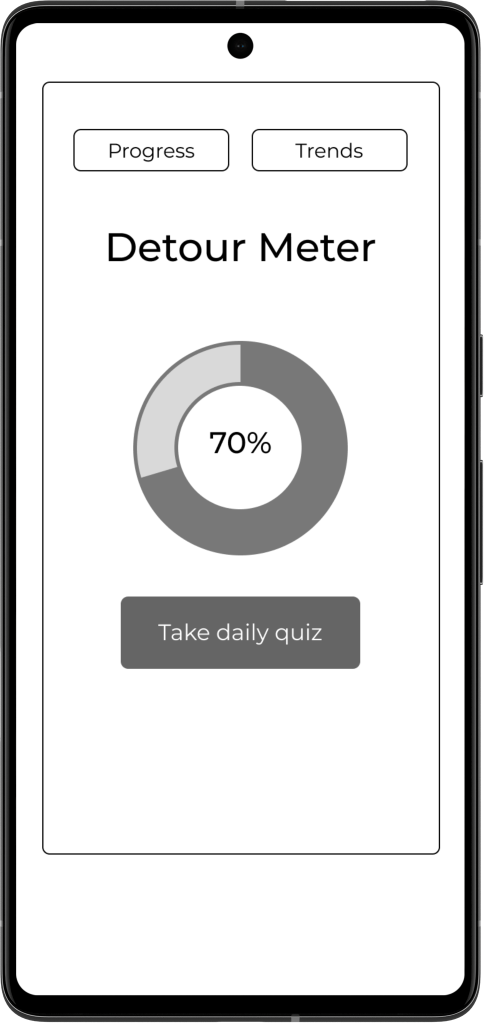
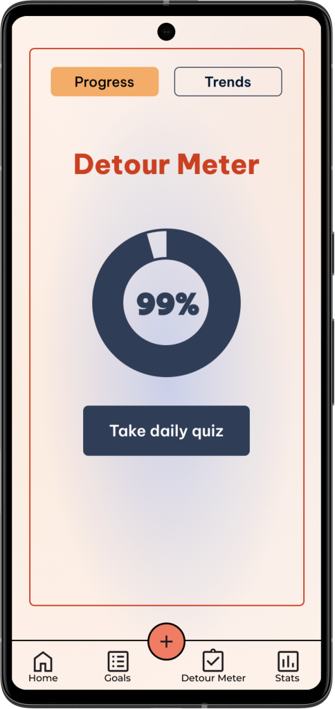
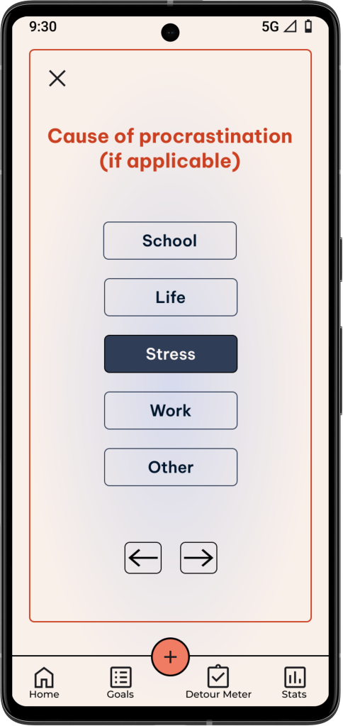
To help me think of ideas quickly, I did an exercise called “playing with opposites”. Through this exercise, it was a stepping stone for me to create the “detour meter”. Instead of the original idea (which is the yellow note), I decided to create a quiz that measures the user’s procrastination and gives tips at the end on how they can improve their procrastination.
Prototype
User Flows
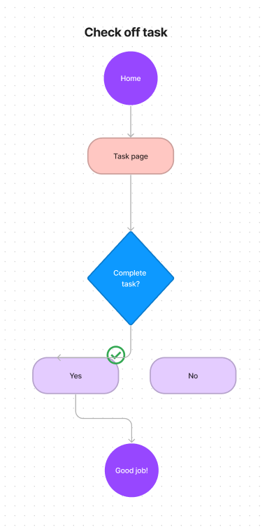
I created 4 user flows for what I wanted to create and test. The flows included, signing up for the app, adding a task to complete, completing a task, and completing the detour meter quiz. This helped to demonstrate how the user would complete the tasks and show the options they would have.
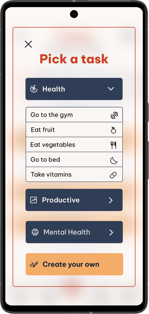
I felt that each flow that I created are essential parts of the app that needed to be tested to determine the usability of the app. They are also needed for the user to get what they need from the app. The tasks are based on prior research. For example, the flow shown was based on user interviews. The user’s goals often fall under one of the 3 categories. I also wanted them to be able to enter any specifics they wanted to include for the tasks.
Low-Fidelity Wireframes
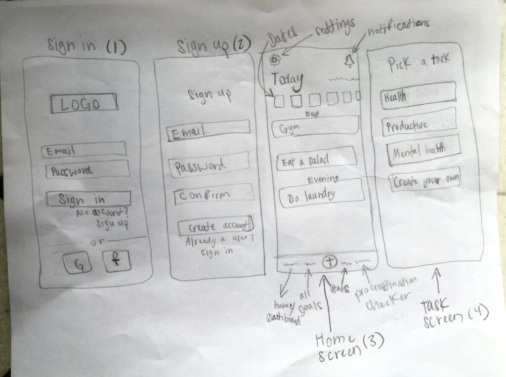
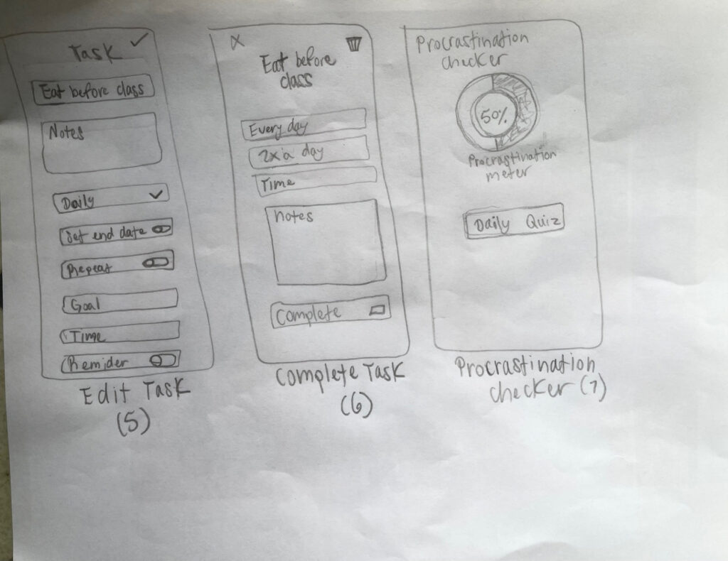
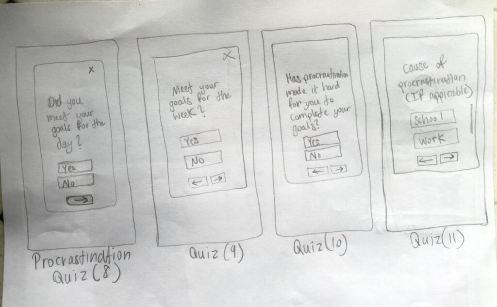
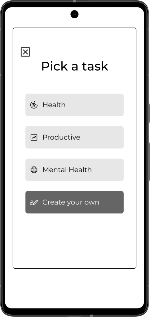
Based on the user flows, I created low-fidelity wireframes. The full flow was demonstrated first before moving on to mid-fidelity wireframes. I made sure to include the essential features, such as the list of upcoming days, and task creation. I was also going for a simple but effective interface.
Mid-Fidelity Wireframes
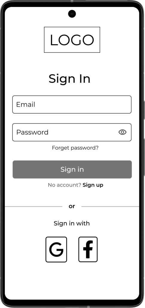
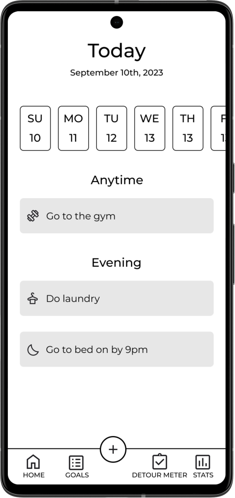
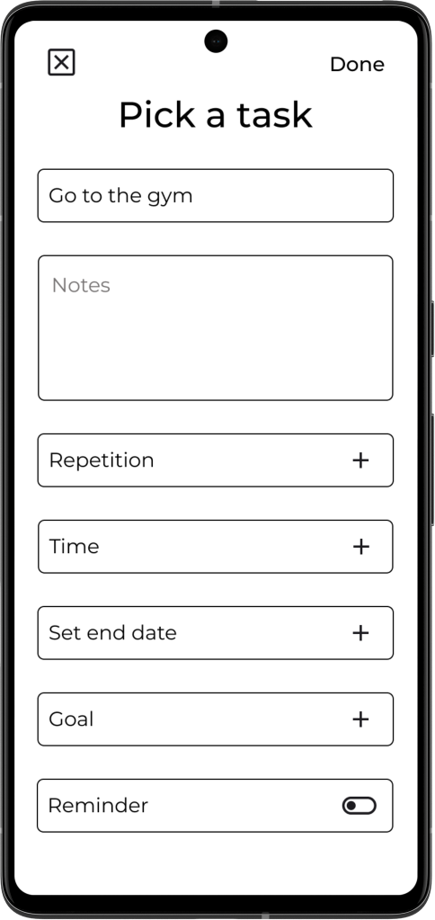
After creating the low-fidelity wireframes, I created the mid-fidelity wireframes. I built upon the low-fidelity wireframes and added all the necessary details.
Branding
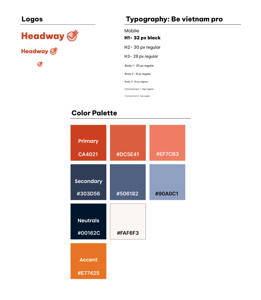
With the branding, I first started with my brand values and audience. My audience is individuals ages 21-35 who have goals important to them that they want to complete. My audience also includes people who struggle with procrastination and need encouragement. With both in mind, I thought of a warmer color palette and round typography that evokes encouragement.
Regarding the logo, I wanted it to represent the word “headway” while also evoking feelings of determination.
Brand values:
- Encouraging
- Helpful
- Personable
- Caring
High-Fidelity Wireframes
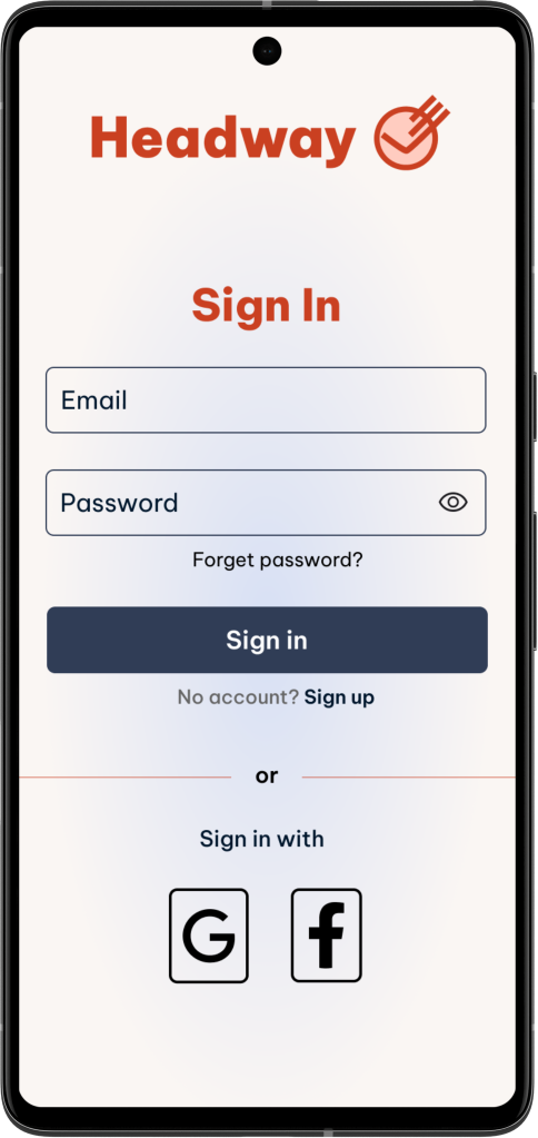
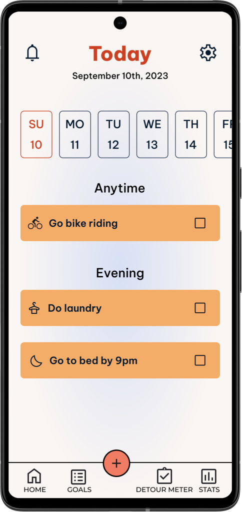
Based on my mid-fidelity wireframes, and feedback, I applied the branding and UI, and created high-fidelity wireframes. I wanted the design to catch the user’s eye while keeping them engaged. I used icons to help identify buttons on the homepage and pick a task page. The yellow color was used as an accent to break up some of the orange and blue elements.
These are the 1st high-fidelity versions. And from there, I prototyped the screens in Figma.

Test
Usability Testing
5 people ages 21-35 participated in user testing remotely through zoom. Notes were transcribed using Otter. The four flows I created were tested.
Task Flows
- Sign up and create an account for the Headway app.
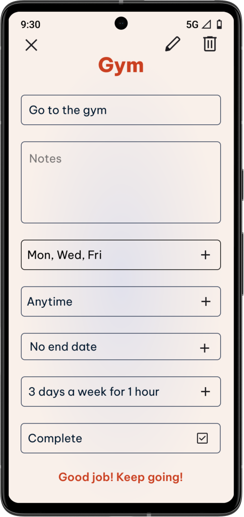
- Add a task for going to the gym and edit the repetition, time, end date, goal, and reminders for this task.
- Complete the task for going to the gym for the day.
- Complete the detour meter quiz.
Feedback and Severity Grids
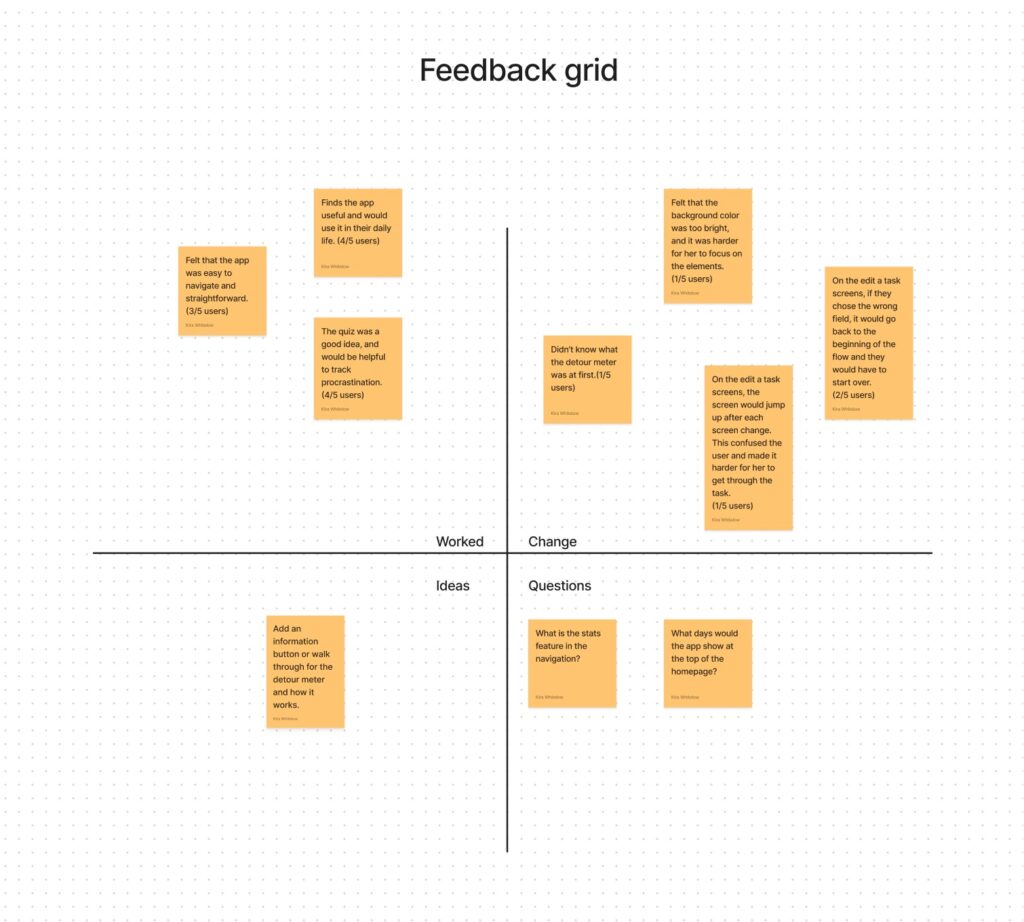
I created a feedback grid to organize participant’s feedback and issues. I used it to see what worked, what didn’t, to see what new ideas they had, and to gather questions they asked.
I then took the notes from the feedback grid and put them on a severity grid to measure the frequency and severity of the issues users had.
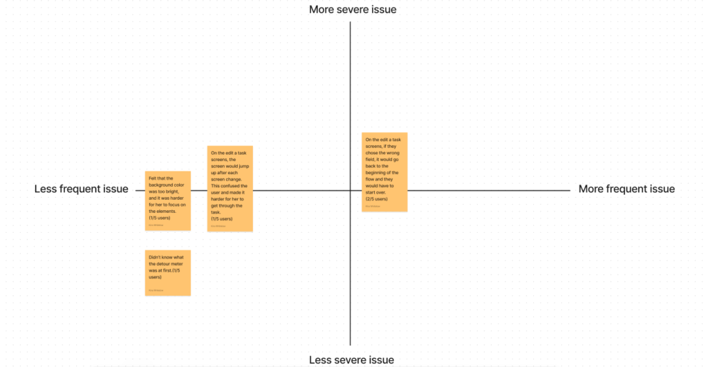
Results
- 5 out of 5 participants got through each task flow in under 3 minutes.
- 2 out of 5 participants finished each task flow in 1 minute or less.
- 2 out of 5 participants took about 2 minutes to finish the pick-a-task flow.
- 2 out of 5 participants gave their rate of satisfaction and experience a 10.
- 3 out of 5 participants felt that the flows were easy to get through and straightforward.
- 4 out of 5 participants find the app useful and would use it in their daily lives.
- 4 out of 5 users found the detour meter to be a good idea and helpful.
- 2 out of 5 users had issues getting through the edit-a-task flow.

Success Metrics
Time: I wanted to have the users finish each flow in under 3 minutes. This metric was met.
Satisfaction: The goal was to have all users be satisfied and give a high rating. This goal was mainly met. 2 users gave a 7/10 and the rest gave ratings of an 8 or above.
The task completion rate: The goal was to have all users complete each task. The completion rate was 100%.
Error rate for tasks: The goal was to have an error rate of 20% or less for each flow. I would say that this goal was met.
Ease of use: Most users reported that the product was easy to use and straightforward.
Iterate
Revisions
I made revisions based on the severity and feedback grids. I also made revisions based on group critiques and mentor feedback. There was a good amount to change to improve the prototype. See below for what was changed.
Before

After
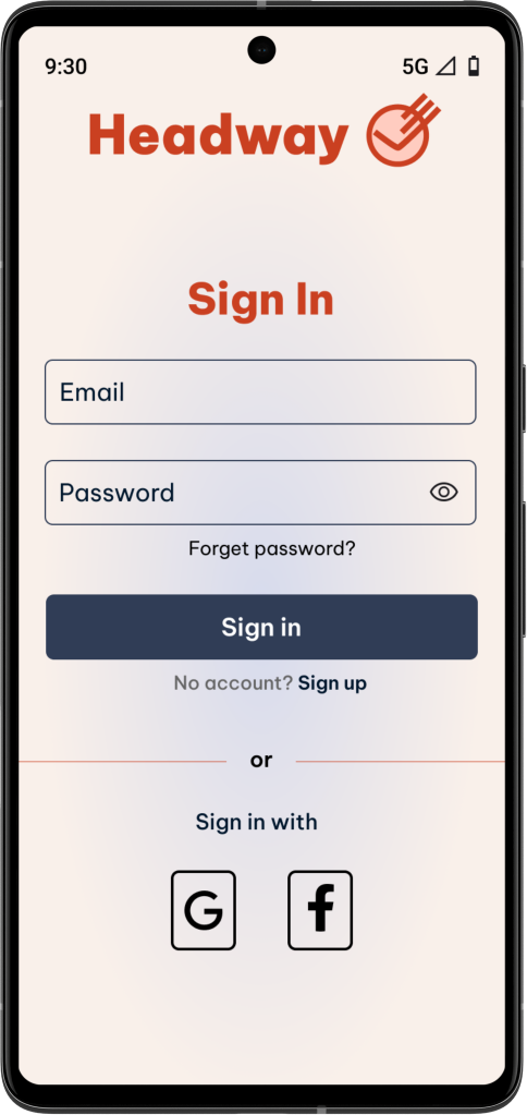
Based on feedback from my mentor and from usability testing, I made the social media icons smaller and the background darker. One of the participants reported feeling like the background was too bright, and made it hard for her to focus on the elements.
I also added in the icons for the wifi, battery, time, and 5g so that the app looks more realistic.
Mid-fidelity wireframes
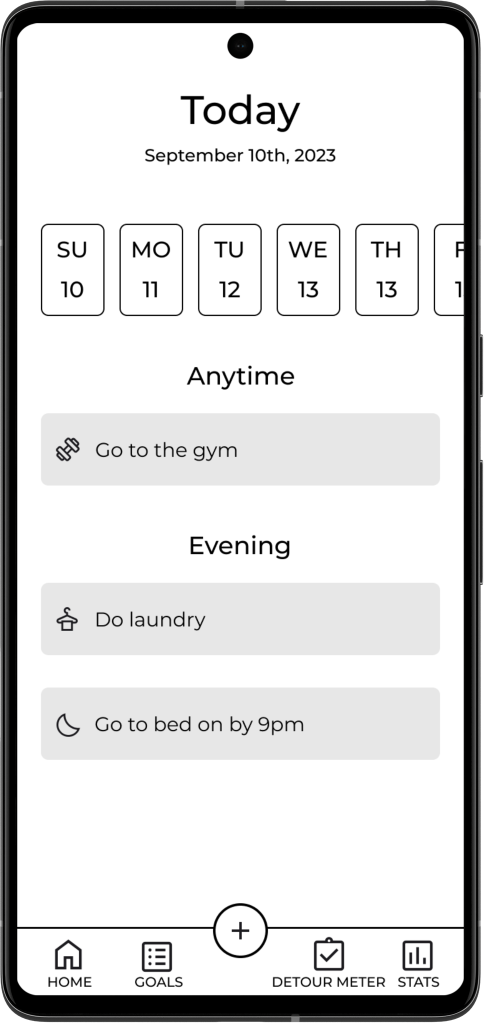
High-fidelity version 2

Final version
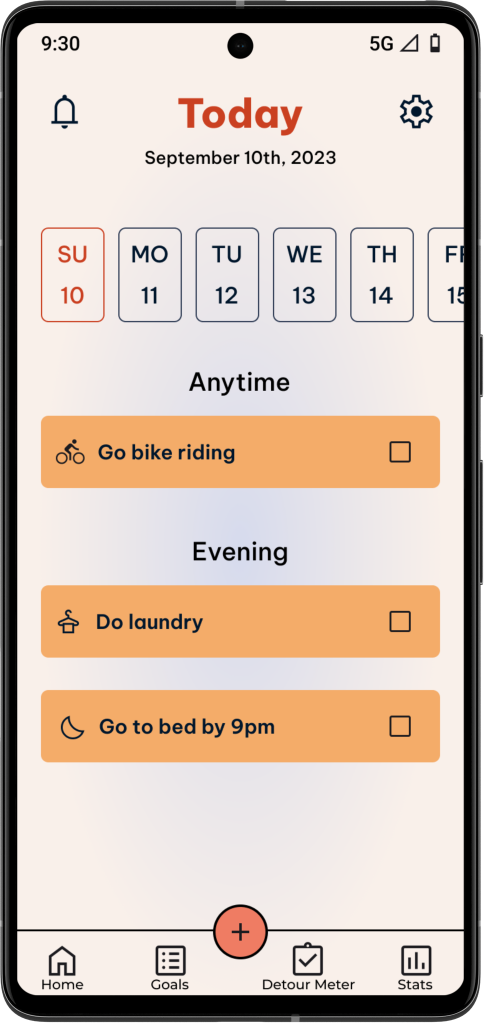
At first, I was going to have the “going to gym” task already on the dashboard and have the user go through adding the task.
However, I felt that it would make more sense to have the users actually add the task instead of it already being there. So I took going to the gym off the dashboard in the beginning of the flow.
I made the navigation icons text title case to make more room between the text. I also added the checkboxes so the user knows to complete them.
Before
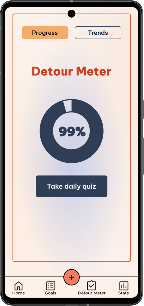
After
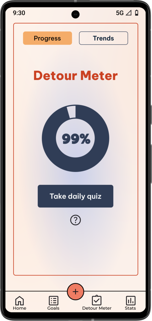
After
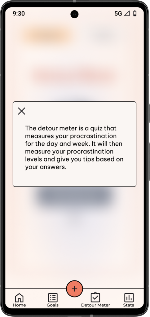
Based on user testing, I added a question icon that explains what the detour meter is.
I also fixed the borders around the screens that has one, so that it fits properly in the phone screen.
Before
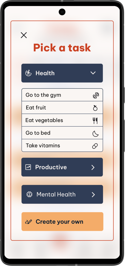
After
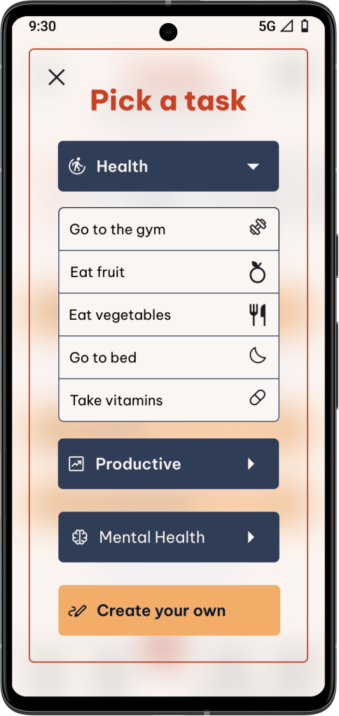
The links in the before screen were too small, so I made them bigger for easier tapping. I also made the arrows fit android’s material guidelines.
Before
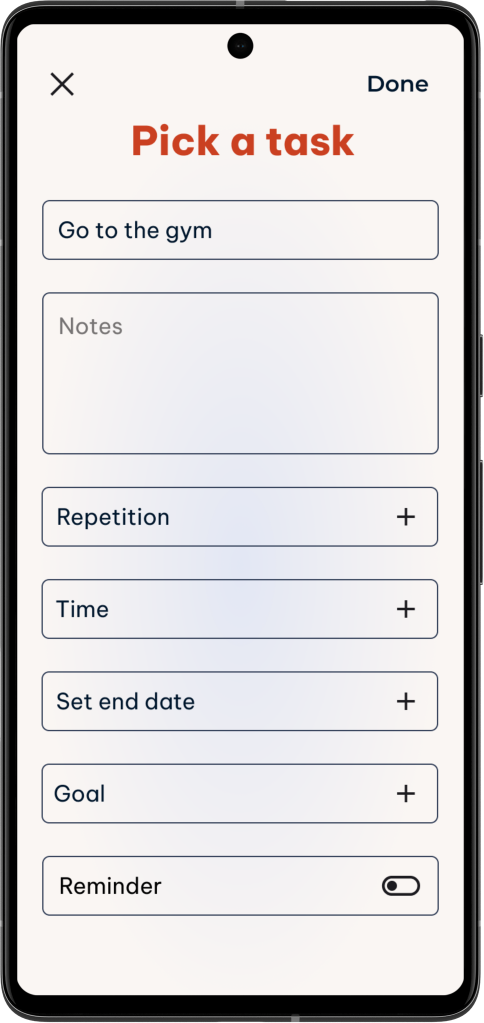
After
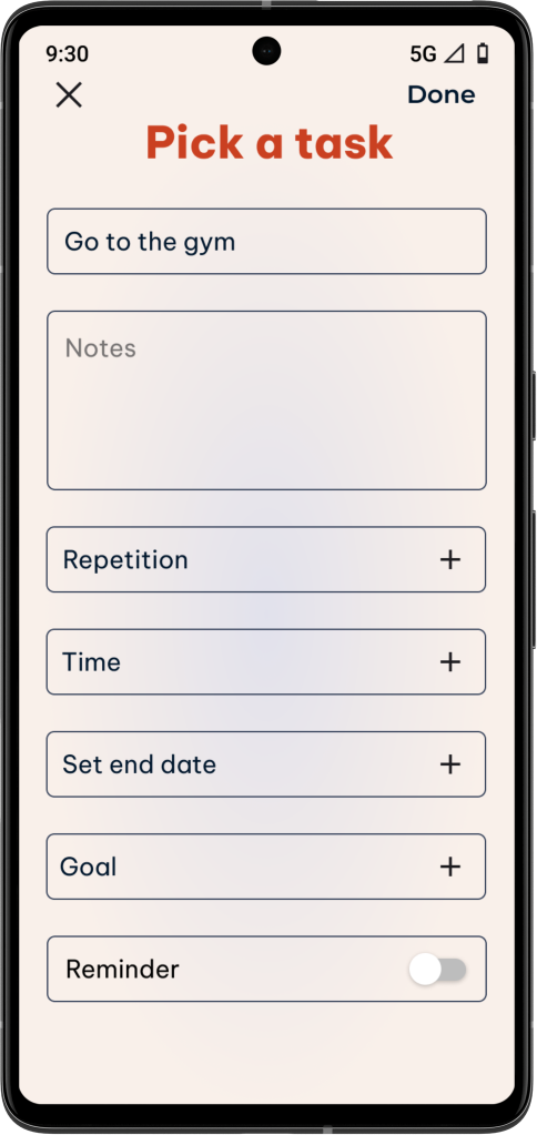
To make the toggle switch fit within android’s material guidelines, I added the correct toggle switch. Also, there was an error within this flow where some hotspots were added on accident, making this flow harder for 2 participants to get through. This was also fixed.
Before
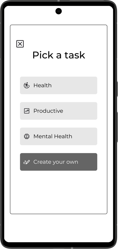
After
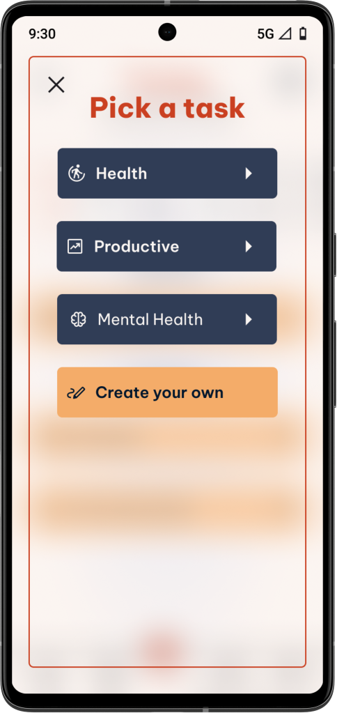
At first, I was going to have “going to the gym” not be under these categories, and have the user create the task, but then (based on feedback from group crits) realized that putting it under the health category would make much more sense.
The Final Design



Conclusion
This project was a great way for me to understand Android phone standards and learn how to design for them. It was difficult because I’ve never owned an Android phone, so I was unfamiliar with some aspects of Android’s typical UI. At first, there were some issues with aligning certain elements to the material design guidelines. However, I did my research and I’m happy with how it turned out in the end. From that, I learned to double-check design guidelines if I’m not sure about something. I’m also happy with the feedback I got from usability testing. Due to the feedback, I was able to make many changes that made the app a better product. It also makes me happy that most users said that they would use the app in their daily lives. It was a great learning experience.
Next Steps
If I had more time, I would consider the following:
- Add more advanced options for the “pick a task flow” to make it more personalized.
- Do more research and brainstorm on what else I could add to the app that would be helpful to users.
