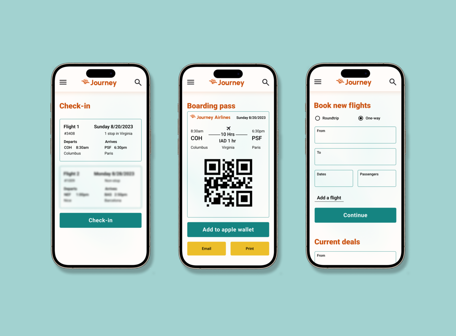
Journey airlines offers affordable flights with detailed filtering options.
My Role
I was the sole UX/UI designer for this project. This includes the research, wireframes, design, branding, and prototyping.
Type
Responsive website
Tools
Figma, pencil, and paper.
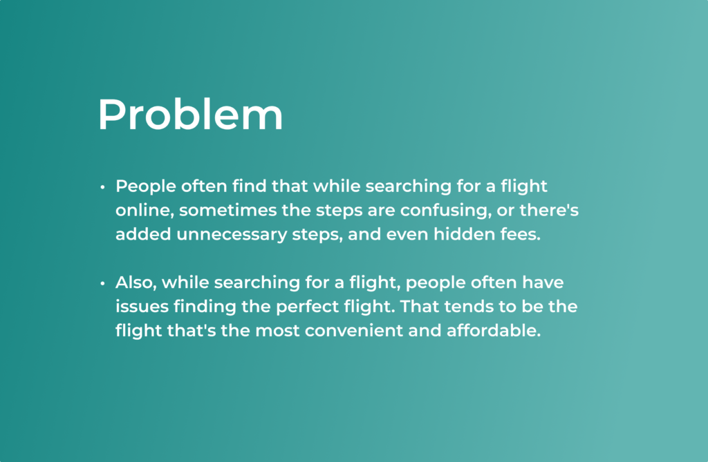

Empathize
User Interviews
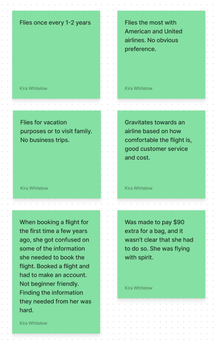
User interviews were conducted with 3 individuals between the ages of 20-45. An affinity map was done to organize findings.
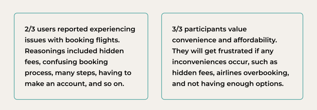
Key Findings
Define
User Personas
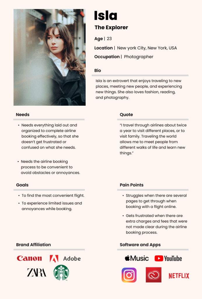
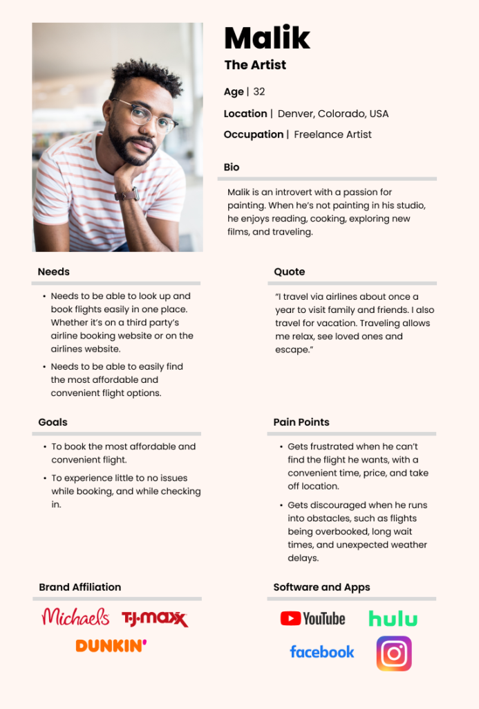
Based on user interviews and the affinity mapping results, I came up with two different personas to represent the audience.
The personas show that users value being able to book flights easily with no hassle and book convenient flights that are affordable.
How Might We?
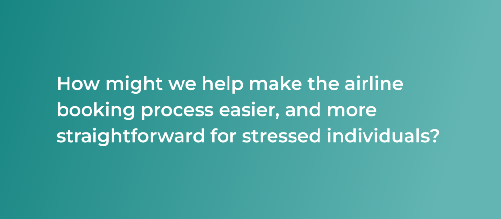
Point of view and how might we statements were made to hone in on the main problem and to help me figure out how I would go about solving the user’s problem.
Ideate
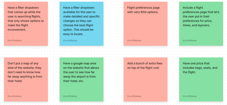
Playing with opposites
To start ideating quickly, I did an exercise called playing with opposites. From there, I came up with advanced filters as a feature to help users book flights more easily. I also thought of a feature that allows users to book multiple flights at once.
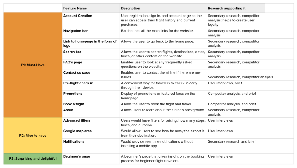
Feature Roadmap
After ideating, I went on to lay out the features. This helped me to see exactly what I would need to include. There are fewer features because I’m focusing on the minimum viable product, and in this case, getting there means fewer features. However, all of the must-haves were included.
Prototype
Site Map
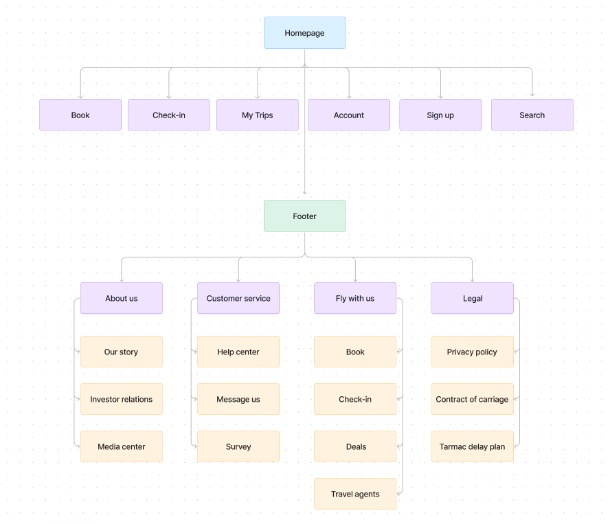
After completing the feature roadmap, I moved on to creating a sitemap. I created a sitemap to lay out the navigation and important pages on the website.
I felt that having the book, check-in, trips, account, sign-up, and search links in the main navigation was essential.
User Flows
After completing the sitemap, I moved on to the user flows. I chose to do user flows rather than task flows because I wanted to lay out the entire user experience. The user flows helped me to lay out details for each flow. These flows correlate directly with the research I’ve done, and what my users are used to doing when going through an airline’s website.

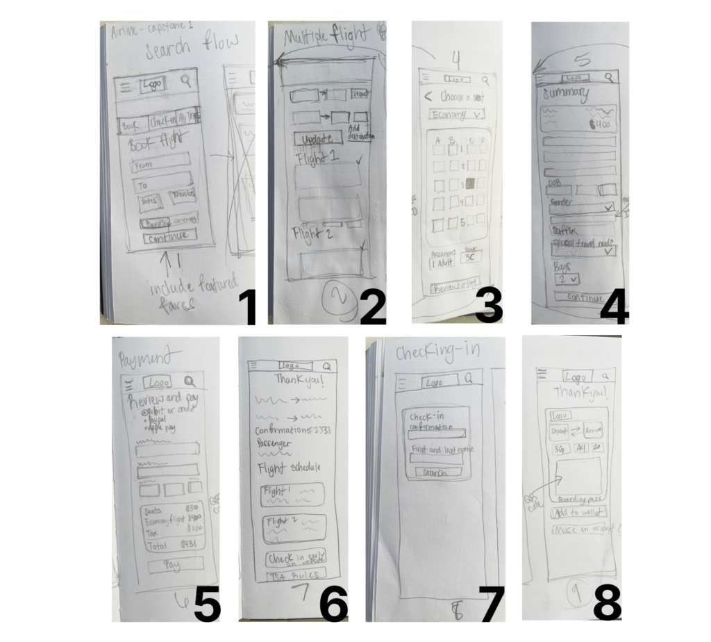
Low-Fidelity Sketches
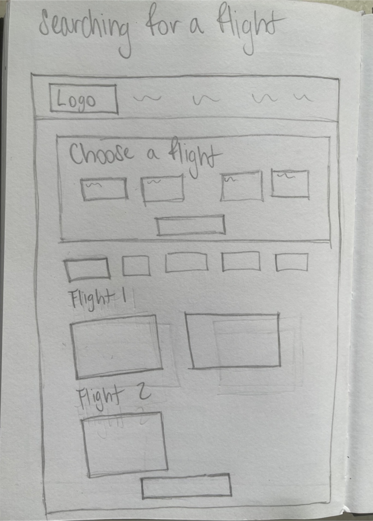
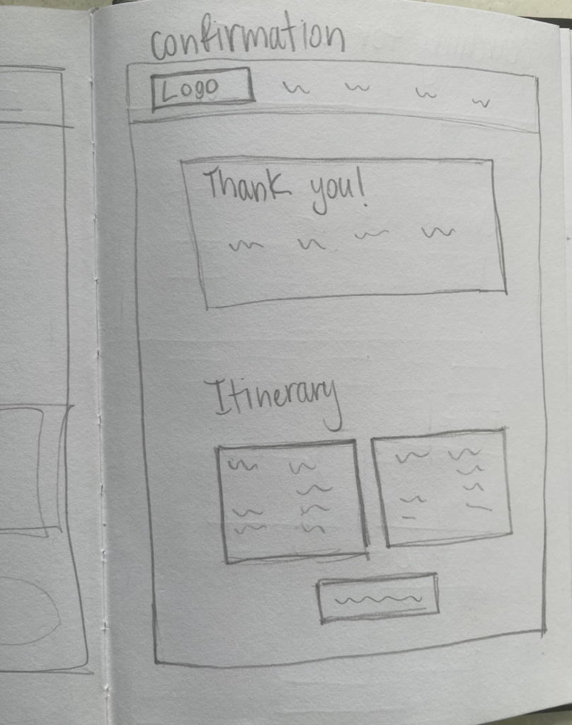
From there, I created wireframe sketches for the airline’s website. Specifically, I created wireframes for the searching, booking, and check-in flows. I got suggestions on how to make it better from group crits, so the order of the sketches changed a few times.
Desktop/Tablet Sketches
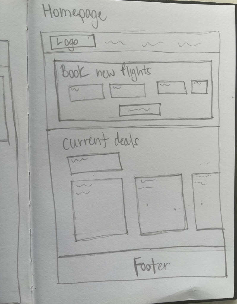
Mid-Fidelity Wireframes
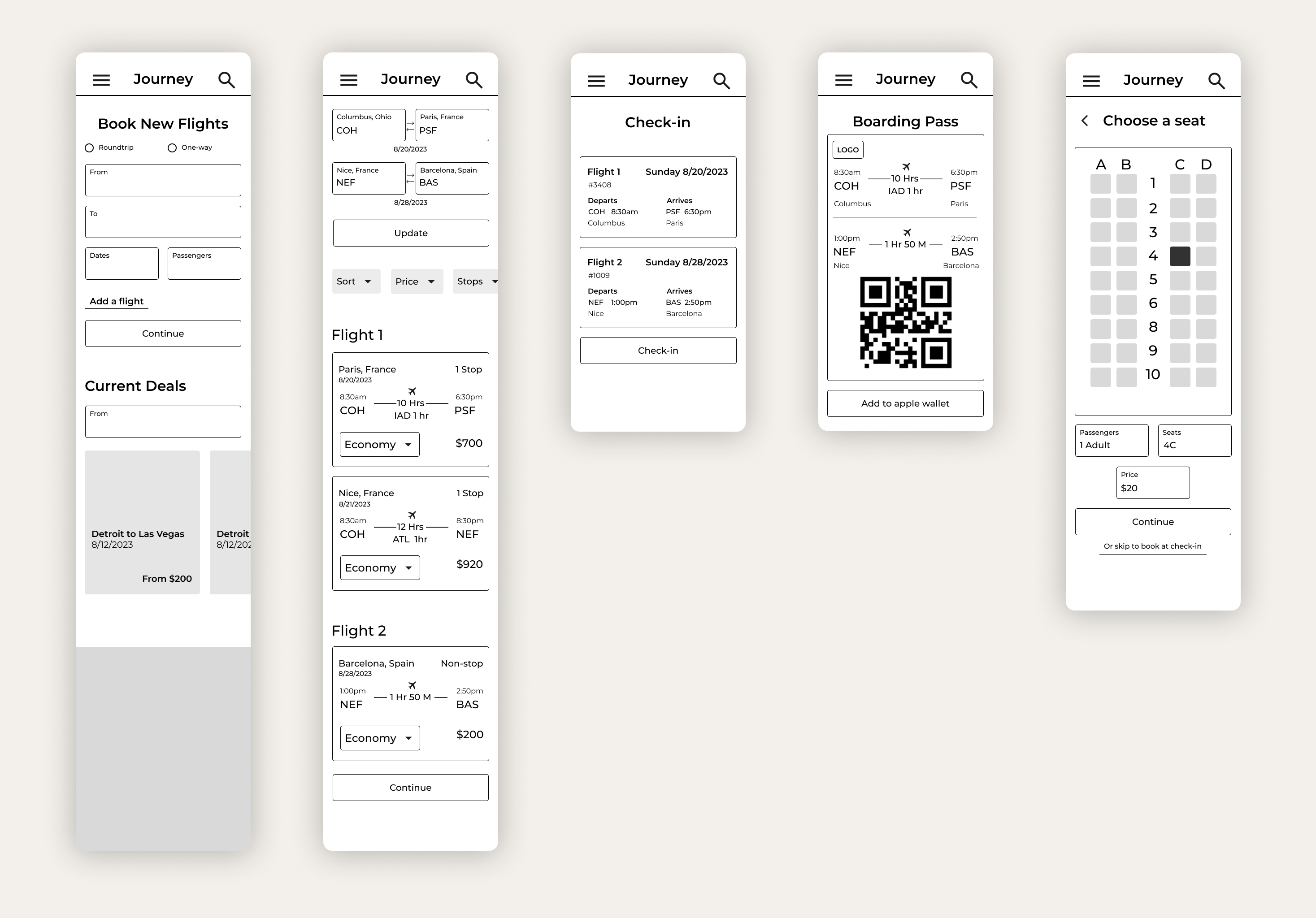
From there, based on the feedback I got from my mentor and group crits, I brought my wireframes up to mid-fidelity and created a prototype showcasing three flows. I decided to conduct user testing at the mid-fidelity stage and prototype from there.
Test
Usability Testing
- 5 people ages 20-25 participated in usability testing remotely. I decided to do testing at the mid-fidelity stage so that I could make changes and get feedback on the flows earlier.
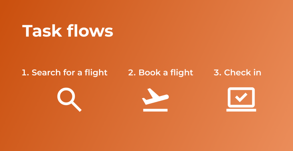
- The participants were given scenarios and were asked to complete 3 tasks.

Usability Testing Results
- 4/5 participants got through all flows in 2 minutes or less.
- 5/5 participants gave their overall rate of satisfaction a 9 or above.
- 5/5 participants have their overall experience an 8 or above.
- 5/5 participants felt that the flows were easy to get through and straightforward for the most part.
- 2/5 users had no difficulty getting through the flows.
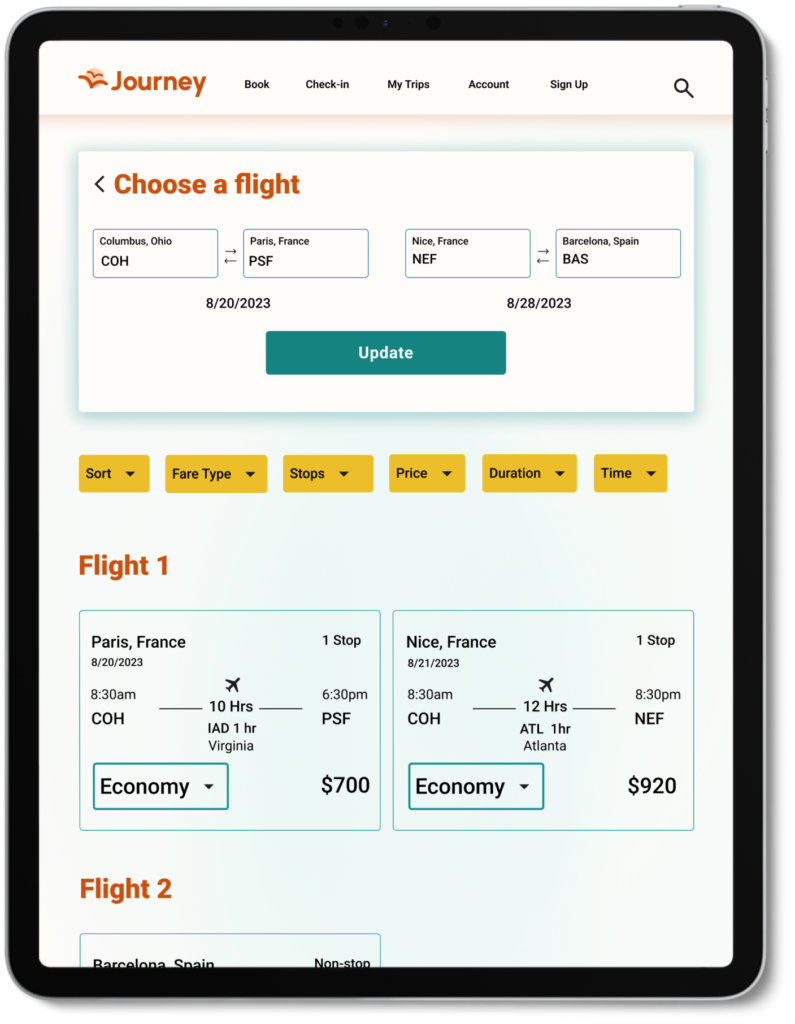
- 3/5 people were confused on the choosing a flight page.

UI
Branding and Logo
After completing usability testing, I took the user’s suggestions into consideration and started the branding. When doing the branding for the website, I got stuck on how I would want to go about it. To help me get started, I identified the brand values and audience. After identifying the brand values and audience, I created the color palette, and then the logo. I associated the brand’s values with brighter colors. Also, my inspiration for the logo was birds flying in the sky. They’re always traveling, so this inspired the name and logo for the website.
Brand Values
- Friendly
- Diligent
- Helpful
- Energetic

UI Kit
These are the final components I came up with. With the branding and components, I really focused on aligning them with my brand values.

High-Fidelity Wireframes
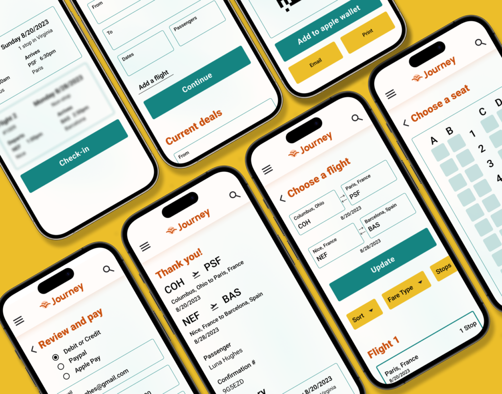
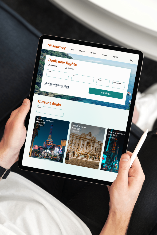
After completing the branding, I brought the mid-fidelity wireframes to the highest fidelity. I created mobile and tablet screens. I made any changes needed based on user testing, group crits, and mentor feedback. Additionally, I wanted to create a friendly but professional interface. The brighter colors were applied minimally in the background to create a gradient background and used as accents throughout the website.
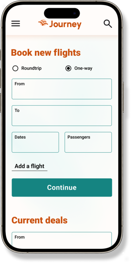
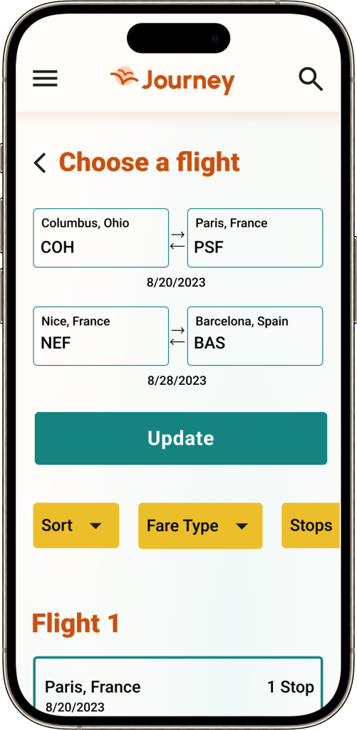
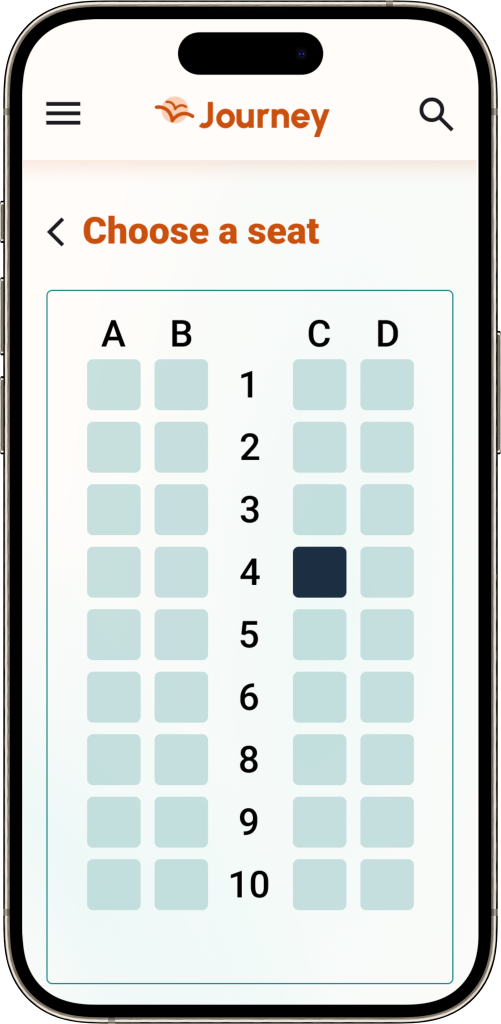
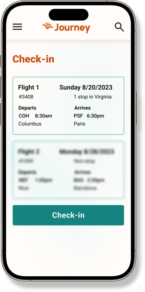
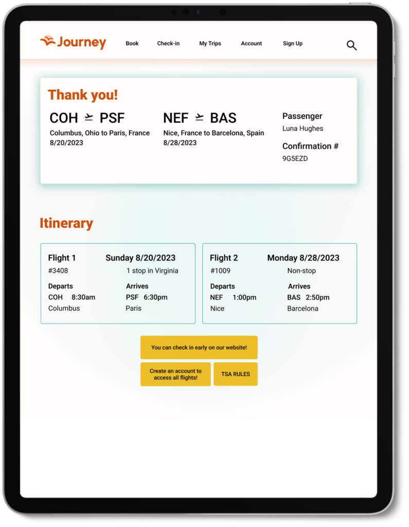
If the user books more than one flight, I wanted to indicate that they have another coming up soon.
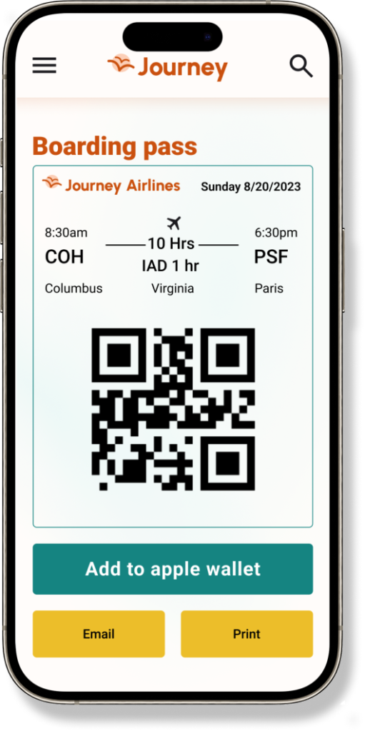
For this screen, I wanted to make the QR code the center of attention so that it could easily be scanned. I also added the email and print links for people that don’t use the apple wallet feature.
Iterations
Before

After

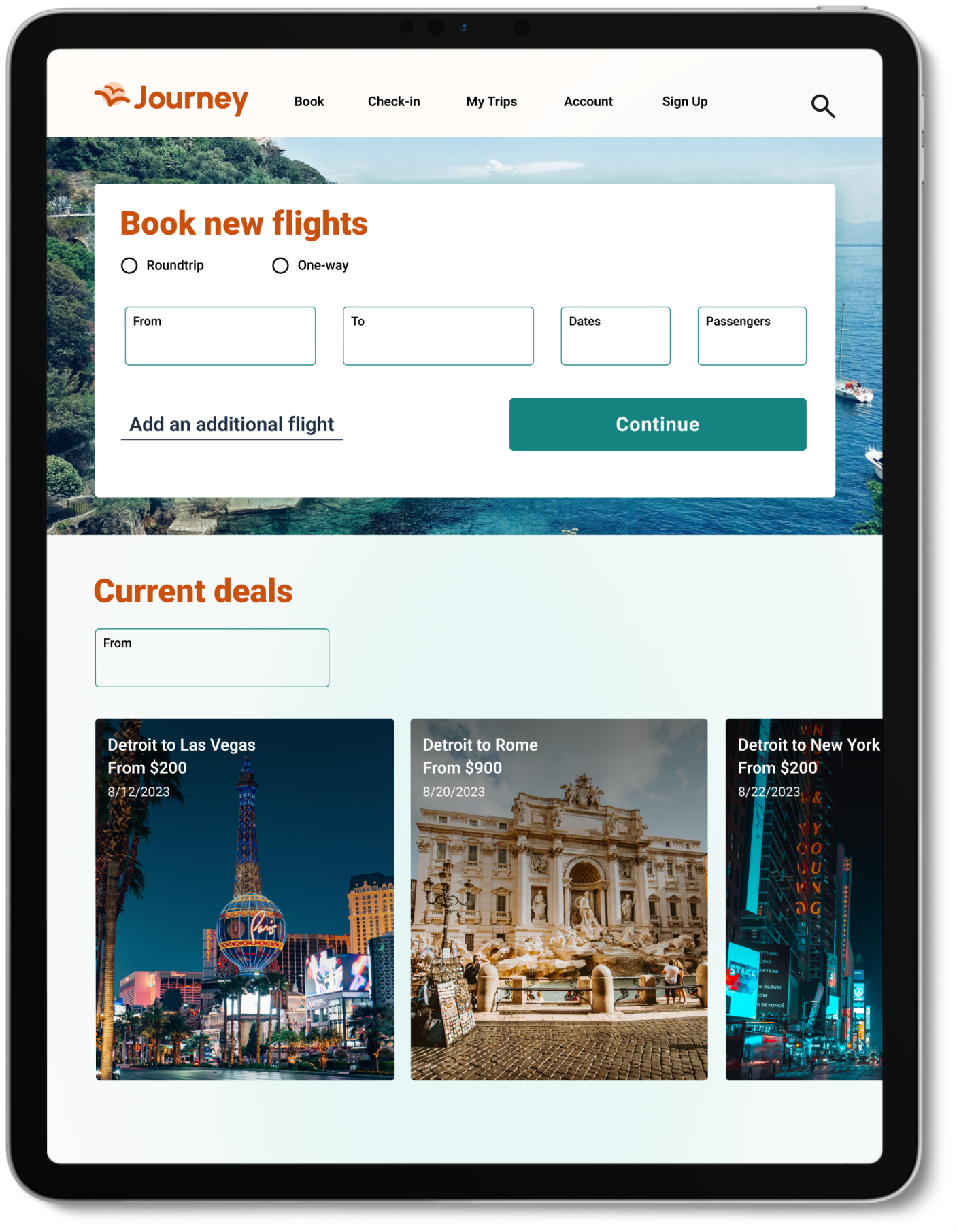
- Navigation elements were made smaller to leave more room for the elements and logo.
- Alignment for titles was made consistent.
- “Add a flight” is now phrased more specifically.
- Text placement for cards was changed to show more of the image.
- A title was not added to the original page. I added a title so that users would know what the page is about.
- Specified where the layover would be.
Before

After

Before
After
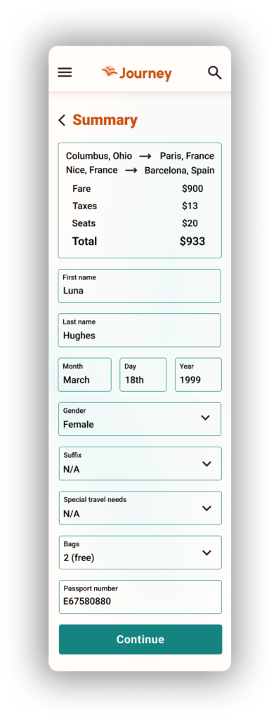
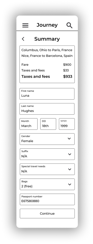
- Included the cost of seating in the total.
- Specified the day and year for birthday.
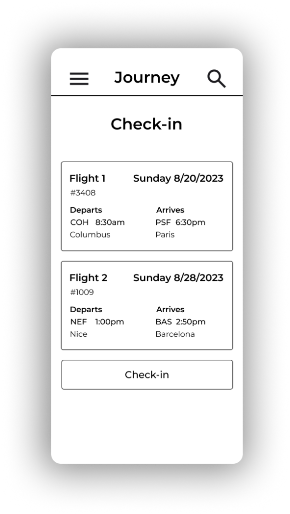
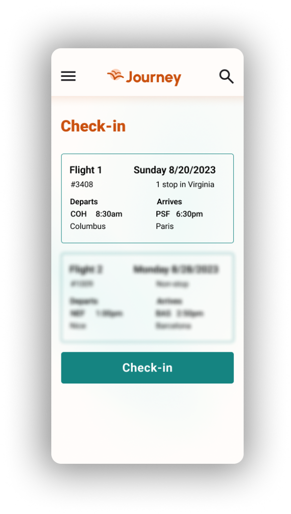
Made the first flight visible, and the second flight blurred, to indicate that they had another flight coming up.
Before
After
Before
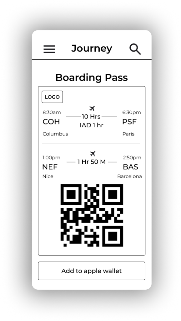
After
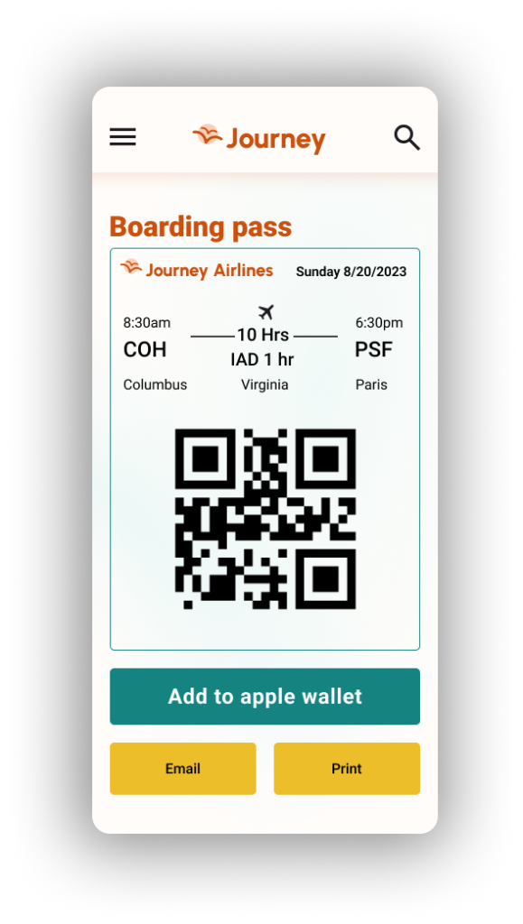
- Made only one flight visible, because someone wouldn’t check in for two flights at once.
- Added an email and print option so that the user would have more options besides adding it to their Apple wallet.
The Final Design
Conclusion
This project was a challenging one, as I’ve only booked flights twice, and I don’t book flights very often. However, with the research I conducted, I was able to fill in the gaps. This project taught me about responsive design, designing for an airline, the pain points people go through with booking a flight and making an airline app as user-friendly as possible. I’m glad that I conducted user testing at an earlier stage for this project so that I could incorporate the participant’s feedback sooner rather than later.
The user testing provided a lot of insight for me and allowed me to fix issues that would make the website less easy to use. Overall, I’m happy with how the website turned out and have met my goals with this project as far as honing in on my responsive design skills and meeting my goals with the usability testing results.
Next Steps
If I had more time, I would consider adding features such as booking hotels, renting cars, and vacation bundles to make the website and airline more attractive to users.
